Most UX problems fail not because teams lack data or effort, but because the problem itself is poorly understood. Modern product teams work with tangled systems of user motivations, contexts, and constraints — yet most conversations collapse into screens and features within minutes, missing the relationships that actually drive behavior.
A concept map is a tool for stepping back and giving that complexity a shape. It is a visual sense-making framework that connects ideas, objects, and events into a meaningful structure of knowledge. Instead of vague notes and post-its, a concept map forces clear sentences like “A influences B” — and through that discipline, it turns scattered insights into shared understanding.
Why Complex UX Problems Are Hard to Think About
A single user behavior is shaped by many forces at once:
- Motivation and emotion
- Social context
- System constraints
- Product policy
- Technical architecture
When those forces live only in our heads or scattered across documents, thinking stays shallow. Teams tend to focus on UI instead of behavior, jump to solutions too early, and miss hidden dependencies between concepts.
Complexity itself is not the problem. Unstructured complexity is. Without a way to externalize and organize understanding, teams fall back on opinions, fragmented insights, or oversimplified linear user flows that hide more than they reveal.
Think of unstructured complexity as a thousand puzzle pieces dumped from a box. All the pieces are there, but without the picture on the lid, no one knows where to start. A concept map provides that picture.
What is a Concept Map?
A concept map is a visual sense-making framework that connects ideas, objects, and events into a meaningful structure of knowledge. In plain terms, it forces you to replace vague notes with clear sentences like “A influences B.”
At its core, a concept map is a tool for three things:
- Identifying the concepts that matter
- Making the relationships between them explicit
- Turning those relationships into meaningful sentences
Unlike brainstorming or sticky-note clustering, a concept map is not about generating more ideas. It is about organizing what you already know and discovering new meaning through the relationships between concepts.
Most concept maps share three traits:
- They start from a focus question
- They organize concepts from general to specific
- They use explicit linking words to describe relationships
Every connection must answer one simple question:
“How are these two things related?”
A concept map works a bit like a subway map. Listing the stations alone tells you nothing useful, but once you draw the lines that connect them, the structure of the city becomes visible at a glance. A concept map turns abstract knowledge into that kind of structural view.
Concept Map vs Mind Map: Key Differences
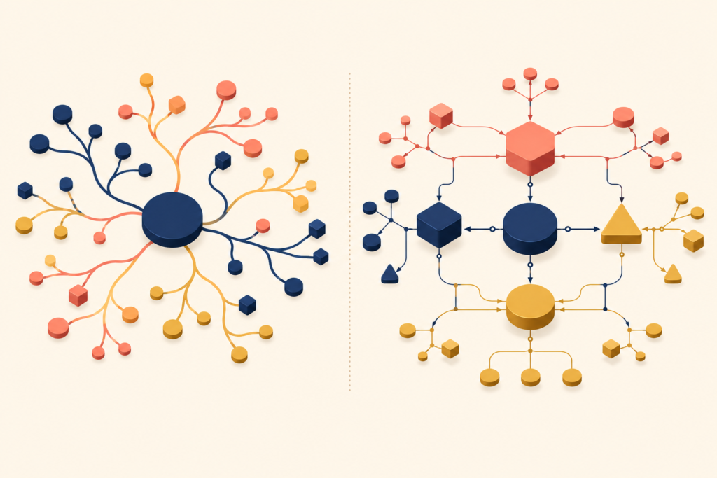
Concept maps are often confused with mind maps, but they serve very different purposes.
A mind map starts from a central idea and branches outward. It favors free expansion, idea generation, speed, and creativity. Mind maps are well suited to brainstorming, early exploration, and individual ideation. The structure looks like a tree: branches extend from a trunk in any direction, with no required relationship between them.
A concept map starts from a focus question, follows a top-down hierarchy, and emphasizes meaning and relationships. It requires explicit reasoning between every pair of concepts. Concept maps are better suited to understanding complex systems, synthesizing research, and aligning a team on the structure of a problem.
In short, mind maps help you think wider, while concept maps help you think more precisely about meaning and relationships.
A useful analogy: a mind map is a free sketch, while a concept map is an architectural drawing. Sketches are great for laying out ideas quickly, but constructing a real building needs a drawing where structure and relationships are spelled out.
When Concept Maps Shine in the UX Process
Concept maps are not always necessary. They earn their keep at a few specific moments in the product lifecycle.
Early discovery and problem framing. Concept maps help when the problem itself is unclear, stakeholders disagree on what matters, or research feels fragmented. Before debating solutions, the map aligns the team on what is actually being discussed. This is the detective moment: pinning evidence to a board and connecting it with string until the shape of the case appears.
After research, during synthesis. Once interviews and data are gathered, teams often get stuck at simple summaries. A concept map connects insights from multiple sources, surfaces patterns, and turns findings into explanations rather than lists. Each insight alone has limited meaning; combined through relationships, they produce understanding none of them could provide on their own.
Before deciding strategy or scope. Before choosing what to build, what not to build, and where to focus, a concept map clarifies what actually drives user behavior and system outcomes. Going into a strategic decision without that map is like planning a campaign without studying the terrain — no amount of effort makes up for the missing structure.
Concept Maps as a Sense-Making Tool
Sense-making is the process of turning information into understanding. It is a well-established concept in design, research, and organizational theory, used to describe how people construct meaning in complex situations.
UX teams collect many things: research insights, metrics, interview quotes, observation notes. Collection alone does not produce insight. A concept map helps by:
- Making complexity visible instead of hiding it
- Making assumptions explicit
- Allowing relationships to be questioned, broken apart, and rebuilt
As you connect concepts, you often find gaps in your understanding, overloaded concepts hiding several ideas at once, and unexpected connections across domains. Insight rarely comes from a single data point. It comes from how ideas relate to each other.
Sense-making is like looking at the night sky. The stars (data points) are already there, but only when you draw lines between them do constellations (patterns) appear. A concept map is the tool that helps you find those constellations in your data.
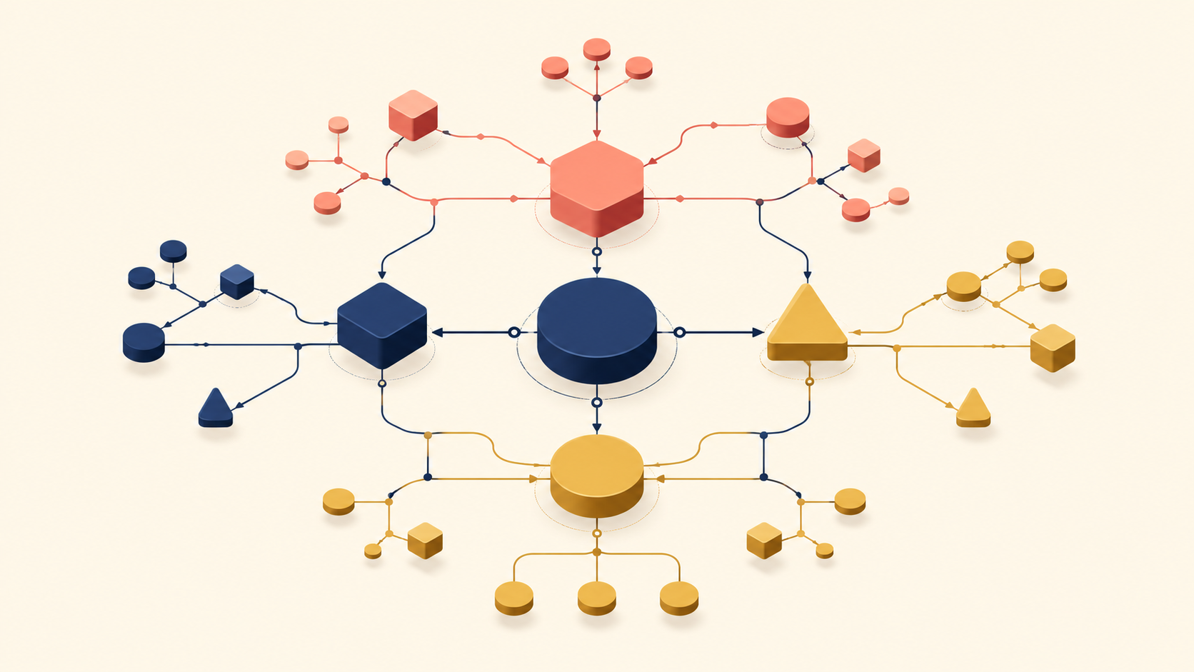
The Core Components of a Concept Map
A concept map looks simple on the surface. Its power comes from three precise components. Weaken any one of them, and the meaning of the whole map collapses.
Concept
A concept represents an idea, object, or event within the problem space. It is usually expressed as a noun. In UX and product work, concepts typically come from three places:
- User behaviors: sharing, searching, saving
- System elements: feed, notification, privacy setting
- Mental models: trust, ownership, visibility
A good concept is clear and unambiguous, carries only one meaning, and sits at an appropriate level of abstraction. A common mistake is bundling several ideas into one concept — something like “easy sharing experience.” That hides complexity instead of revealing it. Think of concepts as Lego blocks: each block needs one clear shape to combine with others. A block stuffed with several shapes cannot be assembled at all.
Linking words
Linking words describe how two concepts are related. They are usually verbs or short verb phrases:
- enables
- constrains
- influences
- requires
- conflicts with
Linking words are not decoration. They force you to commit to a specific relationship. They produce sentences like:
- “Privacy settings influence sharing behavior.”
- “Notifications trigger re-engagement.”
If you cannot describe the relationship clearly, that usually means you do not yet understand it. Linking words play the role of verbs in a sentence. “Apple banana grape” means nothing on its own; “Apples replace bananas” carries meaning. A concept map without linking words is a sentence without a verb.
Proposition
A proposition is the meaningful sentence formed when two concepts are joined by a linking word. It is one complete unit of meaning:
- Concept + linking word + concept = proposition
For example:
- “Social context shapes photo-sharing decisions.”
- “Audience visibility influences posting frequency.”
Propositions are where knowledge is built. Each one explains why a specific behavior occurs. As propositions accumulate, you move from listing facts to building structured understanding of a system. A proposition is close to a scientific hypothesis: “As temperature rises, metal expands” links two phenomena in a single, testable sentence. A collection of such hypotheses eventually becomes a theory.
How to Build a Concept Map: Step-by-Step UX Example
1. Start with a focus question
Every concept map starts with a focus question. The question sets the scope, direction, and depth of the thinking.
Compare these two questions:
(Weak) How do people read content today?
→ Produces a list of current behaviors
A question about surface behavior produces surface observations: “they skim headlines,” “they scroll fast,” “they avoid long reads.”
(Strong) How do people want to read content?
→ Invites exploration of intent, friction, and possibility
A strong focus question is open, exploratory, and centered on understanding rather than solutions. It treats the root cause of behavior as the subject, not the symptoms. The focus question works like a camera lens: the same landscape produces very different photos depending on which lens you choose.
2. Identify core concepts
Next, list the most important concepts related to the focus question. In practice, 15 to 25 concepts is a good range. Fewer oversimplifies the system; more overwhelms and paralyzes early thinking.
Concepts usually come from user interviews and research notes, product metrics and logs, domain knowledge and constraints, and existing assumptions that need to be tested. At this stage, do not rank or connect them yet. Aim for clarity and coverage.
Example concepts for “How do people want to read content?”:
Reading intent
Attention
Cognitive load
Context
Time availability
Perceived value
Trust
Content depth
Sense of control
Format
This step is like preparing ingredients before cooking. You lay everything on the table that the recipe (focus question) needs. You do not yet decide on order or quantity. The point is to see what you have.
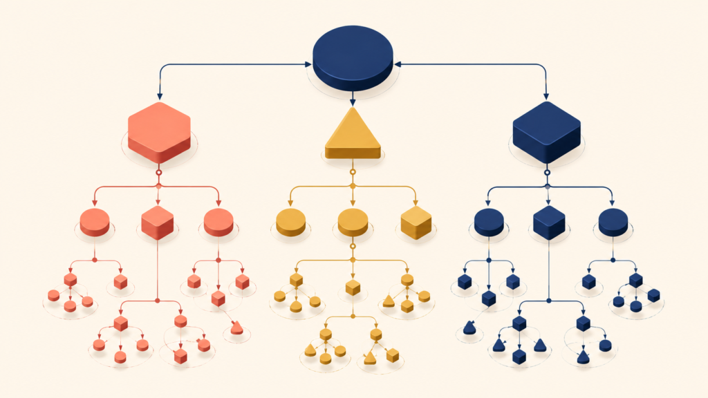
3. Build a hierarchy
With the concepts in hand, organize them from general to specific. Higher-level concepts cover broader ideas, influence many other concepts, and sit closer to the focus question. Lower-level concepts are more specific, describe mechanisms or details, and depend on the higher ones.
A simple test: “If this concept changes, do many other concepts change too?”
Applying that test produces a hierarchy like:
Reading intent and motivation
│
├── Context
│   └── Time availability
│
├── Attention
│   └── Cognitive load
│
├── Perceived value
│   ├── Content depth
│   └── Trust
│
└── Reading experience design
    ├── Format
    ├── Sense of control (save, resume, highlight)
    └── Interaction patterns
The hierarchy makes one thing clear: people do not want “reading with better UI.” They want a reading experience that respects their intent, context, and effort.
4. Add linking words and form propositions
Now connect concepts using explicit linking words. Each connection should read as a meaningful sentence:
Reading intent [determines] desired content depth
Limited time [increases] sensitivity to cognitive load
Trust [increases] willingness to invest attention
High cognitive load [reduces] perceived value
These propositions explain why a given reading experience succeeds or fails. If you struggle to find a clear verb, you do not yet understand the relationship.
5. Make cross-links
This is where concept maps become genuinely powerful. Cross-links connect concepts across different branches of the hierarchy and reveal relationships that linear thinking would never expose.
Trust [reduces] perceived cognitive effort
Context [moderates] tolerance for long-form content
Sense of control [increases] reading engagement
Cross-links often produce the most valuable insights because they expose hidden dependencies. Do not force them. If a relationship is unclear, the uncertainty itself is useful information. The most interesting cross-links work like discoveries between disciplines — the way physics and biology met to produce biophysics.
6. Iterate toward meaning
Finally, refine the map. Break apart overloaded concepts. Remove ideas that do not serve the focus question. Strengthen weak or vague propositions.
A finished map should let you:
- Explain how people want to read without mentioning UI at all
- Discuss trade-offs with stakeholders more clearly
- Derive design principles instead of feature ideas
You are not designing screens yet. You are designing understanding.
Good vs Bad Concept Maps: What Separates Them
Not every concept map is useful. Many look impressive but produce no insight. The difference between good and bad concept maps is not visual polish. It is semantic clarity.
A bad concept map usually crams too many concepts at the same level, uses vague linking words like “related to,” lacks a clear hierarchy, and reads more like a brainstorm than an explanation. The classic symptoms are familiar: everything connects to everything, no clear sentence can be read off the map, and the map fails to answer its own focus question. Such a map does not reduce complexity. It is a map where every road leads everywhere — full of information, but useless for choosing a destination.
A good concept map, by contrast, has a clear top-down structure, uses precise linking words, produces readable propositions, and makes assumptions visible. You should be able to trace a path from the focus question to a specific insight, and explain why each connection exists. Good maps often feel slightly uncomfortable because they force decisions about meaning. They resemble a skilled doctor’s diagnosis: symptoms, causes, and treatment are logically connected, and the reasoning behind each step can be explained.
Conclusion
In product development, it is easy to equate progress with visible output: new screens, new flows, new features. But strong products are not built from screens. They are built from clear understanding.
A concept map is a reminder that design is fundamentally about meaning — the meaning behind user behavior, the meaning behind system constraints, the meaning behind trade-offs. Skipping that step means investing resources in problems that were never properly understood.
For product teams, a concept map offers more than a UX technique. It slows thinking down without losing momentum, replaces opinion with explicit reasoning, and aligns teams around a shared understanding. As you move into more senior product roles, your leverage comes less from how quickly you ship ideas and more from how well you structure complexity. A concept map is one of the simplest tools for training that muscle.
If you have ever felt that a UX problem is “too complex to explain,” that is exactly the moment a concept map is most useful. Start small. Try it during research, after research, and whenever a team’s shared understanding starts to drift. Over time, the change is subtle but significant: conversations become sharper, decisions become better grounded, and design starts to reflect understanding rather than assumption.
Leave a Reply