You finish a round of interviews, usability tests, support-ticket reviews, and field observations. Your notes are full. You learned something. But when someone asks what to do next, the answer feels unclear.
This is not a problem of effort, and it is not a problem of data volume. It is a gap between the two things research produces:
- Research output — what you collected
- Shared understanding — what it means and what it implies
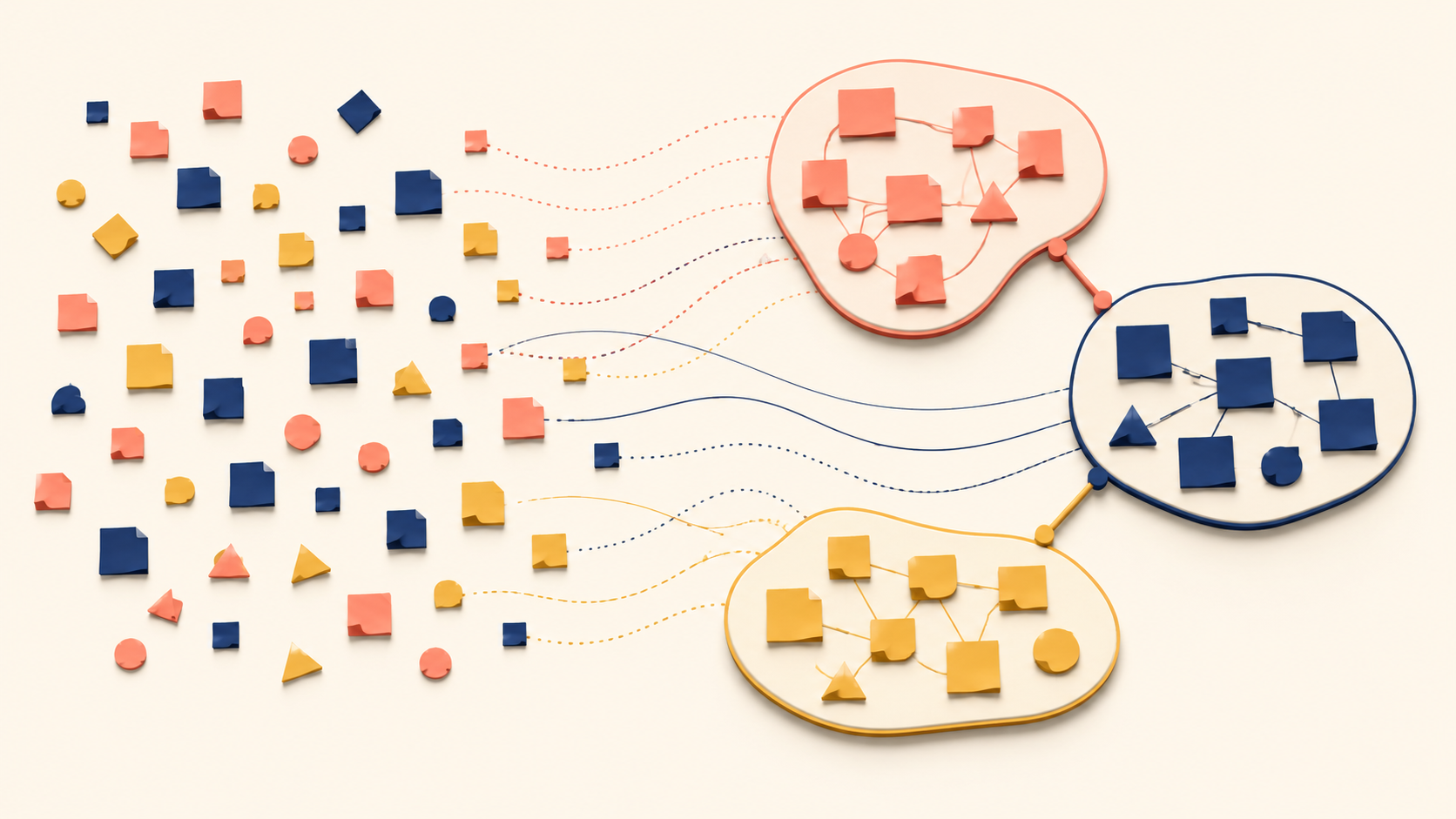
An affinity diagram is the tool most often used to close that gap. It groups raw qualitative observations into clusters, lets themes emerge from the data itself, and turns scattered details into a small set of insights a team can act on. This guide explains what an affinity diagram is, when it works best, the five components that make it function, and how to recognize a good one from a bad one. By the end, you will have a working model of affinity diagramming as a thinking process — not as a wall covered in sticky notes.
Why UX Research Data Often Fails to Become Insight
Qualitative research produces context-rich information:
- What someone said
- What someone did
- What someone avoided
- What confused someone
- What someone was trying to accomplish
When that information stays trapped in individual notebooks, recording files, or one researcher’s memory, synthesis breaks down. Three patterns appear instead:
- Team members remember different moments
- One vivid quote stands in for the whole study
- Decisions drift toward intuition rather than evidence
Writing a “research summary” does not always fix this. Summaries are linear. They are good for storytelling, but they are not always the right format for finding patterns across dozens of observations.
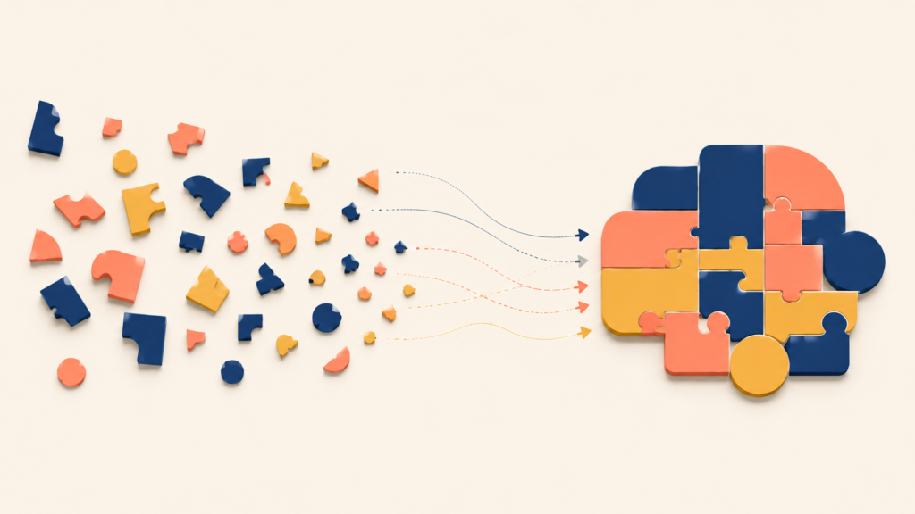
A useful analogy: fragmented qualitative data is like a jigsaw puzzle split among several people. Each person holds a few pieces and guesses what the picture shows. Someone insists it is a landscape, someone else is sure it is a portrait. Until all the pieces sit on the same table, no one can see the full image. Research data behaves the same way — patterns only appear when the pieces are gathered and arranged together.
Most teams do some organizing. They tag notes in a document, group findings into bullet points, build a “top 5 insights” slide. The problem is that structure imposed too early — top-down — leaves results that feel like this:
- Themes too broad to act on
- Insights that cannot be traced back to raw data
- Disagreements like “that is not how I read it”
A simple frame makes the gap visible:
| What you have right after research | What decisions actually need |
|---|---|
| Many specific moments | A few meaningful patterns |
| Individual quotes and behaviors | Shared language the team agrees on |
| “Interesting findings” | Insights ready for decisions (what to change, why, for whom) |
That conversion — from messy detail to shared pattern — is the point where most teams get stuck.
The other reason synthesis fails is speed. The pressure to move on after research is real:
- Brainstorm features
- Update the backlog
- Iterate the design
- Discuss the roadmap
The pressure is understandable. But when teams skip synthesis, the consequences are predictable:
- Fixes target symptoms instead of causes
- Prioritization defaults to internal preferences
- The same debate reappears every quarter
The result is not “bad decisions.” The result is decisions with weak evidence. Skipping synthesis is like prescribing medication from a single blood-pressure reading without analyzing the rest of the checkup. The number alone cannot tell you whether the cause is stress, diet, or sleep — you treat the symptom and miss the source. Product teams that skip synthesis repeat the same mistake.
What Is an Affinity Diagram?
Search for “affinity diagram” and you will almost certainly see a photo of a wall covered in sticky notes. The image is not wrong, but it is incomplete. Focusing on the surface hides what makes affinity diagramming actually useful.
Definition: An affinity diagram is a bottom-up synthesis method that groups observed data points by natural relatedness, allowing meaning to emerge from the data itself rather than from predefined categories.
The method was created in the 1960s by Japanese anthropologist Jiro Kawakita, who needed a way to make sense of ethnographic field notes. It is sometimes called the KJ Method(K-J Method), after his initials, and is now standard in qualitative research, product design, and quality management.
Inductive Process
In practice, building an affinity diagram looks like this:
- Start from small, concrete pieces of data
- Group what feels similar
- Name each group in a way that explains why those items belong together
- Gradually form higher-level themes that reflect the actual patterns in the data
The process is fundamentally inductive. You are not testing a hypothesis. You are discovering structure.
The core shift in thinking is simple:
Move from concrete observations to general meaning.
Imagine reviewing notes from customer onboarding sessions:
- “User paused for a long time on the permissions screen”
- “User asked whether they could skip setup and return later”
- “User said, ‘I’m worried I’ll break something’”
Each is just a moment. Grouped together, they point at something else:
“Initial setup feels risky and irreversible to new users.”
That sentence did not exist in the raw data. It emerged through grouping and interpretation. This is why affinity diagramming is called a thinking tool, not a documentation tool.
Inductive synthesis works the way doctors recognize a new condition. A physician does not decide “this is the flu” and then fit symptoms to the diagnosis. They observe similar symptom patterns across many patients until they notice something unfamiliar — a pattern that did not match anything known. Affinity diagramming uses the same logic: let the pattern surface from the evidence.
Misconceptions around Affinity Diagram
A few common misconceptions are worth clearing up before going further:
| Misconception | Why it falls short |
|---|---|
| “It is just organizing sticky notes” | Organizing without interpretation does not produce insight |
| “It is a brainstorming technique” | Brainstorming is generative; affinity diagramming is analytical |
| “It is only for designers” | Any role working with qualitative data can use it |
| “Clusters should match an existing framework” | That turns a bottom-up method into a top-down one |
Sticky notes are only the tool. The value of an affinity diagram comes from the thinking that happens while grouping and naming, not from the artifact itself. Confusing the board for the work is like confusing writing on a chalkboard for teaching — the chalkboard is the surface, the learning happens in the connections students make.
Many teams are already comfortable with top-down categorization:
- Predefined personas
- Fixed user journey stages
- Existing frameworks like AARRR or Jobs-to-Be-Done
These are useful, but they answer a different question.
| Approach | Core question it answers |
|---|---|
| Top-down framework | “How does this data fit what we already believe?” |
| Bottom-up synthesis | “What patterns actually exist here?” |
Affinity diagramming deliberately delays judgment. It resists naming things too early and tolerates ambiguity. For teams used to fast decisions this can feel uncomfortable, but that discomfort is where the method does its work.
A related method worth mentioning is the concept map. The two often pair well:
- Affinity diagram: focuses on grouping by similarity
- Concept map: focuses on relationships between concepts (cause, sequence, dependency)
Affinity diagramming usually comes first. Once patterns are clear, a concept map can help explore how they connect.
When Affinity Diagramming Works Best
Not every UX research project needs an affinity diagram. The method earns its time when specific signals are present.
Right after qualitative research
The most obvious moment is immediately after qualitative research, while the raw material is still fresh:
- Interview notes
- Observation logs
- Usability test recordings
- Open-ended survey responses
- Customer support tickets or call transcripts
At this point, teams often feel a mix of confidence and confusion. They know there is signal in the data, but they cannot yet say what it is.
Affinity diagramming helps in this state because it:
- Prevents premature conclusions
- Keeps the team grounded in evidence
- Builds a shared view of the data before interpretations diverge
Instead of one person “summarizing” what happened, the team constructs meaning together.
When interpretations diverge or the team wants to jump to features
You can usually hear interpretation drift in the room:
- “That was probably just an edge case”
- “I don’t think users really care about that”
- “What I took away from this was completely different”
Disagreement itself is not the problem. It signals that the data is rich. The problem is when the disagreement stays implicit.
Affinity diagramming externalizes those interpretations:
- Observations become visible to everyone
- Grouping makes assumptions explicit
- Naming a cluster forces clarity
What usually emerges is that the team does not disagree about the facts. They disagree about the pattern and what it means.
The same method also slows down the rush to build. Many product teams default to action after research:
- “We should add a new setting”
- “This needs a redesign”
- “That’s a roadmap item”
Affinity diagramming redirects that energy. Staying with the data a little longer lets the team ask better questions:
- What problem does this actually represent?
- Is this one-off or recurring?
- What is the underlying cause, not the surface friction?
The output is not slower decisions. It is more deliberate ones.
When qualitative data becomes overwhelming
A single interview rarely needs an affinity diagram. Volume changes everything. As a rough guide, affinity diagramming becomes especially useful when:
- There are more than five or six interviews
- Each session produces dozens of observations
- Multiple researchers took notes
At that scale, in-head synthesis breaks down. No one can reliably hold everything in working memory.
An affinity diagram functions as cognitive offloading, letting the team reason about complexity without being overwhelmed by it.
It also produces an underrated benefit: vocabulary alignment. As clusters and themes form, the team starts using consistent expressions — “setup anxiety,” “hidden dependency,” “fear of irreversible actions.” These phrases become shared shorthand. They cut repetition and improve precision when cross-functional teams collaborate, when new members onboard, or when researchers present findings to stakeholders.
The Five Components of an Affinity Diagram
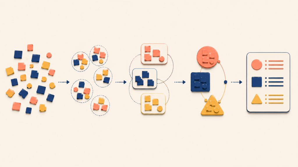
An affinity diagram has five components. Knowing what each one does makes the method easier to build and easier to evaluate. Many teams struggle not because they skip a step, but because they treat the components as decorative rather than structural.
Each component plays a distinct role in turning raw research into something a team can reason about together.
1) Raw qualitative data: the smallest unit of meaning
Everything starts with raw data — the most concrete pieces of information captured during research:
- Direct quotes
- Observed behaviors
- Notable pauses or hesitations
- Workarounds or mistakes
- Emotional reactions tied to specific moments
A useful test:
If it still feels like interpretation, it is not yet raw data.
| Too abstract | Better raw data |
|---|---|
| “Users were confused by onboarding” | “User re-read the same instruction three times before clicking ‘Next’” |
| “People don’t trust the system” | “User said, ‘I’m worried this will overwrite my existing data’” |
Keeping raw data granular matters because grouping only works when the inputs are comparable.
Example: a cloud-based document collaboration tool
A product team is studying first-use onboarding for a cloud-based document collaboration tool. They want to understand why so many new users create accounts but never create or share a document on day one.
The team focuses on three data sources covering the first 10 minutes of use:
- Moderated usability test recordings (screen and voice)
- Session replays of new users who dropped off mid-onboarding
- Post-session interviews
Two researchers independently review recordings and transcripts. Each time they see a specific action, hesitation, or verbal reaction, they pause and copy the moment verbatim into a working document. No rewriting. No summarizing.
Sample entries extracted directly from the recordings:
- “User paused mouse movement for 8 seconds on the ‘Create workspace’ screen”
- “User said: ‘Can I rename this later?’”
- “User opened a new tab and searched ‘rename workspace later’”
- “User hovered over ‘Invite teammates’ field, then clicked ‘Skip’”
- “User said quietly: ‘I don’t want to mess this up’”
- “User deleted the default document within 3 seconds of it opening”
- “User clicked ‘Finish setup’ and exhaled while leaning back”
Each entry is a single observed moment.
2) Externalization: getting the data out of your head
Raw data sitting inside a document or recording still carries hidden context. Affinity diagramming requires externalization:
- One observation per card or note
- No condensing several ideas into one
- Minimal interpretation in the wording
Whether the team uses physical sticky notes or a digital tool, the goal is the same: each piece of data must be movable, visible, and equal in weight to every other note. This prevents distortion from creeping in before the patterns appear.
For the document collaboration example, the team converted each raw observation into an individual note on a digital whiteboard:
- Note 1: “Paused 8 seconds on ‘Create workspace’ screen”
- Note 2: “Said: ‘Can I rename this later?’”
- Note 3: “Google searched: ‘rename workspace later’”
- Note 4: “Hovered over ‘Invite teammates’ → clicked ‘Skip’”
- Note 5: “Said: ‘I don’t want to mess this up’”
- Note 6: “Deleted default document immediately”
- Note 7: “Sighed and leaned back after clicking ‘Finish setup’”
At this stage, the notes sit on the board in no particular order. Nothing is grouped or labeled yet.
3) Clustering: grouping by similarity
Once raw data is externalized, the team forms clusters — bundles of observations that feel related, even when the reason is not yet fully articulated. At this stage:
- There is no “correct” grouping
- Intuition is allowed
- Discussion is deliberately minimized
Grouping in silence helps. It reduces anchoring on one person’s interpretation, and lets multiple viewpoints surface through action rather than argument.
Clusters are not yet themes. They are hypotheses in progress.
In the document tool example, the team quietly moves related notes closer together. One group forms around hesitation before irreversible actions:
- “Paused 8 seconds on ‘Create workspace’ screen”
- “Said: ‘Can I rename this later?’”
- “Google searched: ‘rename workspace later’”
- “Said: ‘I don’t want to mess this up’”
These notes cluster because they all occur just before a committing action and involve uncertainty about reversibility.
A second cluster forms around avoiding visible or shared actions:
- “Hovered over ‘Invite teammates’ → clicked ‘Skip’”
- “Deleted default document immediately”
- “Sighed and leaned back after clicking ‘Finish setup’”
These behaviors occur after setup, but show reluctance to engage more deeply. The clusters shift slightly as notes move, but no labels are attached yet.
4) Themes: naming what the cluster actually means
Themes are where interpretation becomes explicit. A strong theme:
- Explains why those items belong together
- Is expressed in a short, clear sentence
- Reflects user intent, tension, or context
Compare two ways of naming the same group:
| Weak theme | Strong theme |
|---|---|
| “Onboarding issues” | “Initial setup creates fear of irreversible mistakes” |
| “Performance problems” | “Slow feedback breaks the user’s sense of progress” |
Strong themes give the team something to debate and act on.
For the document tool, the first cluster receives this theme card:
“Initial setup decisions feel irreversible”
It connects the hesitations, the reassurance-seeking, and the moments users left the product to check externally.
The second cluster receives a different one:
“Users avoid visible actions too early”
It connects skipping invites, deleting default content, and the emotional release after finishing setup.
Each theme is tied explicitly to one cluster, not to the whole board.
5) Insights: from clusters to insight statements
A useful way to validate a theme is to convert it into a sentence:
“Because , users tend to , which leads to _.”
If the sentence feels vague or forced, the theme is probably still too abstract.
This is where affinity diagramming starts connecting to decisions — without rushing into solutions.
For the document tool, the team writes:
From “Initial setup decisions feel irreversible”:
Because creating a workspace appears permanent, users tend to pause, seek reassurance, or leave the product to verify safety, which leads to drop-off during the onboarding flow.
From “Users avoid visible actions too early”:
Because early actions feel socially exposed, users tend to delay inviting others or creating content, which leads to weaker engagement on day one.
The team then cross-checks the insight statements against the original notes to confirm they still hold.
If you are familiar with other sensemaking frameworks, the parallels will be visible:
| Affinity diagram layer | Comparable concept |
|---|---|
| Raw data | Observation / note |
| Cluster | Concept |
| Theme | Proposition or higher-level meaning |
The similarity is not accidental. Most sensemaking methods move from detail to meaning. Affinity diagramming is one of the most accessible versions of that pattern.
Good vs Bad Affinity Diagrams: A Quality Checklist
An affinity diagram session often ends with an impressive-looking wall (or board). Visual density does not guarantee insight.
What a bad affinity diagram looks like
Weak affinity diagrams usually fail quietly. Nothing feels wrong in the moment, but there is little to use afterward.
Common symptoms:
- Clusters labeled with vague nouns
- Themes that restate the problem area
- Insights that cannot be traced to data
- A diagram no one references a week later
| Pattern | Why it breaks down |
|---|---|
| Keyword lists (“Navigation,” “Performance”) | Describes a topic, not a meaning |
| Overly broad themes (“UX issues”) | Hides differences instead of explaining them |
| Premature conclusions (“Users dislike X”) | Over-reads limited evidence |
| Decorative diagrams | Look tidy but do not guide decisions |
These diagrams become dead artifacts — documented and forgotten.
The cause is rarely laziness. Weak affinity diagrams usually come from:
- Pressure to move fast
- Wanting consensus too early
- Defaulting to existing mental models
- Confusing labeling with understanding
When naming a cluster feels uncomfortable, teams reach for safe, broad terms. Those terms drain the diagram of explanatory power.
What a good affinity diagram looks like
A good affinity diagram works as a thinking scaffold. It helps the team reason more clearly even after the session ends.
You can usually recognize one by these properties:
- Themes are expressed as explainable sentences
- Clusters reflect behavior, intent, or tension
- Disagreements are visible and recorded
- Raw data stays attached and traceable
Strong affinity diagrams generate conversation.
One reliable quality test:
Can a teammate who did not attend the research sessions look at this diagram and understand what it means?
If the answer is no, the diagram needs more work.
Strong diagrams can be understood without narration because:
- The language carries meaning
- The examples make the abstract concrete
- The structure shows how the insight was derived
Documentation that preserves insight
Another quiet failure is over-documentation. When a team locks the diagram down too early, they lose the chance to:
- Refine the theme language
- Split or merge clusters
- Revisit assumptions when new data arrives
A healthier approach is to treat the diagram as versioned thinking. As research continues, new observations get captured, insights get reused, and the diagram stays alive instead of frozen.
Affinity Diagrams as a Cross-Functional Thinking Tool
Affinity diagramming is usually introduced in a design context, but its influence is not limited to design work. The real value appears when people from different roles use the same evidence to reason about a problem together.
At its core, affinity diagramming is not a design methodology. It is a shared sensemaking method.
For strategy and decision-making
When a team skips insight synthesis, strategy discussions tend to fixate on solutions like features. Affinity diagramming creates a deliberate pause that raises the quality of problem framing.
With it, teams can:
- Separate symptoms from root causes
- Distinguish one-off data points from recurring patterns
- Express problems in user language rather than internal jargon
This leads to better questions:
- Which of these patterns blocks adoption if left unresolved?
- What assumptions are we making about user intent?
- What trade-offs have users already made on their own?
These questions shape strategy without locking the team into premature answers.
For development teams
Engineers often receive requirements without enough context. An affinity diagram reconnects solutions to the evidence that produced them.
When developers can see the affinity diagram, several things change:
- They see what users were trying to do
- They see where users hesitated or worked around the system
- They see how often each pattern appeared
Understanding why something matters tends to lead to:
- Better implementation decisions
- Fewer missed edge cases
- More meaningful technical trade-offs
It also reduces rework caused by misread requirements. The shift is similar to construction: a crew told “build a wall here” will build a wall. A crew told “this wall sits next to a noisy production line and needs sound insulation” will choose the material and thickness on their own. Engineers given the reasoning behind a requirement consistently make stronger technical decisions.
For cross-functional discussion and organizational effect
Disagreement is unavoidable in cross-functional conversations. The question is how it gets resolved.
An affinity diagram shifts the center of the discussion from “in my opinion” to “this user pattern appears repeatedly here.” Marketing, operations, customer support, and leadership can all join the conversation with the same evidence, even when their interpretations differ.
That shared ground changes the tone of decisions from persuasion to collective reasoning. Over time, teams that use affinity diagramming regularly develop healthier research habits:
- Insights are expected to be traceable
- Assumptions surface earlier
- User language influences internal language
This becomes especially valuable in growing organizations — where members rotate, where context erodes quickly, and where decisions compound over time. Affinity diagrams help preserve not just what was decided, but why it was decided.
Conclusion
Most product work eventually becomes concrete: screens, features, workflows, technical architecture. Affinity diagramming deliberately sits before all of that.
It asks the team to pause and focus on what people are actually doing, what they avoid, and what feels risky, confusing, or valuable to them. The goal is not a ritual. The goal is shared understanding through deliberate sensemaking.
Affinity diagramming is a reminder that doing research does not automatically produce insight. Meaning has to be constructed — collaboratively and carefully.
A practical next step: the next time your team finishes a round of qualitative research, resist the urge to summarize. Externalize every observation as a single, movable note. Cluster in silence. Name each group with a sentence, not a label. Then ask whether a teammate who was not in the room could read the result and understand it.
If they can, the diagram is doing its job. If they cannot, the work is not finished — and that is the point.
Design the meaning first.
Leave a Reply