
In the previous post, we looked at the Empathy stage — the first Lean Analytics stage, where the goal is to confirm that a real problem exists. This post covers the second stage: Stickiness. The central question shifts from “Is this problem real?” to a much narrower one: “Do people actually keep using it?”
Stickiness is not about how many users sign up. It is about whether the few who try the product come back on their own, without reminders or marketing nudges. Cohort analysis examples in this stage show why averages can hide the answer, and why repeat behavior — not raw traffic — is the signal that matters.
What Is the Stickiness Stage in Lean Analytics?
Stickiness is the most misunderstood stage in Lean Analytics. Teams often confuse it with positive sentiment, growing traffic, or shipping velocity, and report things like:
- “People say they love it.”
- “Traffic keeps coming in.”
- “We shipped a lot of features this quarter.”
None of these answer the stickiness question. In Lean Analytics, stickiness has a much narrower meaning:
“After someone tries the product once, do they come back as part of their daily life?”
What matters at this stage is not the size of the user base, but the presence of repeat behavior. Stickiness is about whether the product earns a place in someone’s life. Catching attention once is something else entirely.
Product Stickiness = Retention + Engagement
Stickiness in Lean Analytics is not the count of people who tried the product. It measures whether the product produces repeat behavior without constant external prompting. The clearest way to understand it is as the combination of two things:
Stickiness = Retention + Engagement
- Retention asks: Do people come back?
- Engagement asks: When they come back, do they do things that signal real value?
High retention without engagement often means curiosity without value. High engagement without retention usually means a one-time burst, not a repeated habit. Both signals matter only when they appear together.
That combination leads to the core question of this stage:
“Has this product taken a stable place in the user’s daily life or workflow?”
That “place” is rarely emotional. It is behavioral and situational. For example:
- In work tools, stickiness shows up as a natural weekly rhythm. People open the product not because of reminders, but because the work itself requires it.
- In consumer apps, stickiness appears when a specific situation triggers memory of the product. The product becomes the default response to a recurring need.
The key signal is not intensity but reliability. A product is sticky when users return consistently, with low friction, as part of an already-natural pattern.
Example: Measuring Stickiness in a Habit Tracking App

Consider a simple hypothetical case: a habit tracking app. In the Empathy stage, the team learned that people start with motivation but quickly lose momentum. Existing tools lower the setup barrier well, but struggle to support sustained execution.
In the Stickiness stage, the question changes. The team is no longer asking whether people like the idea. It is asking whether the product produces repeat behavior over time.
What matters here is not the surface signal:
- Total downloads
- App store reviews
Those numbers only describe initial interest. They say nothing about whether the product survives the first contact. The team needs to see whether the product still gets used after the novelty fades. Better questions to track include:
- Do users reopen the app within the first 7 days?
- Does check-in behavior continue into week 2 or week 4?
- Do users who engage with a specific feature stay longer than those who do not?
Together, these signals help distinguish curiosity from commitment. When many people install the app but most drop off within days, the cause is rarely marketing reach. The more common reasons are:
- The core value does not land fast enough.
- The product is not strong enough to displace an existing behavior.
In this context, stickiness is not about scale. The real question is whether a small group of users returns reliably without being pushed.
What the Product Needs at the Stickiness Stage
At this stage, the product does not need an extensive feature set. It needs the core pieces in place. Specifically, it must support:
- One clearly defined core behavior
- A short time to first felt value
- A reason to return without external prompts
Building and shipping beyond that point usually creates more confusion than meaningful learning. For example:
- In a collaboration tool, the focus is not feature breadth, but whether the first real moment of collaboration happens reliably.
- In a content product, the focus is not the size of the content library, but whether a single meaningful loop (consume → save → return) forms.
The product’s job at this stage is to make that loop visible in the data. That is why the following questions matter when deciding what to build:
- Can this feature improve a core metric?
- Can we measure its impact?
- How long does it take to build?
- Does it add unnecessary complexity?
- What new risks does it create?
- Does it produce meaningful learning?
- Have users actually done this behavior before?
- What hypothesis does this feature test?
Iterate vs. Pivot: Reading the Signal Correctly
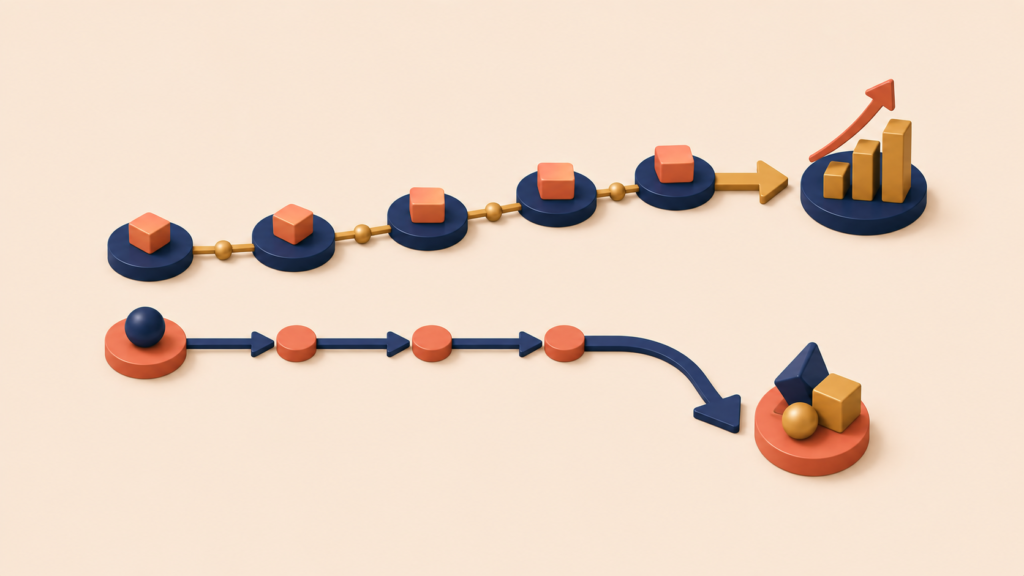
Teams watching the usage data often hit a familiar tension:
Refine what we have, or change direction?
A useful distinction:
- Iterate when:
- The core behavior exists.
- Some users perform it, but not consistently.
- Small changes move metrics, but not enough.
- Pivot when:
- The intended behavior almost never happens.
- Repeated changes do not move the core metric.
- The problem framing itself starts to look weak.
At the Stickiness stage, this decision should rest on how metrics respond over time — not on effort already spent, gut feel, or attachment to the original idea.
How Cohort Analysis Reveals True Stickiness
Stickiness is not a single number. Stickiness is a pattern that unfolds over time. That is why averages often mislead. An average retention rate hides the questions that matter:
- Are new users behaving better or worse than earlier users?
- Did a recent change actually improve long-term behavior, or did it just create a temporary spike?
- Where exactly does usage break down?
Cohort analysis answers these by grouping users around a shared starting point — such as signup week — and tracking how their behavior changes from that point forward. Looking at stickiness through cohorts shows:
- Whether retention curves stabilize or collapse
- Whether drop-off happens at the same point each time
- Whether improvements persist across cohorts, not just in one moment
This distinction matters. Short-term usage gains can look like progress in aggregate metrics, while cohort data may reveal that nothing actually improved for new users.
The goal at the Stickiness stage is not to maximize early engagement. The goal is to confirm that repeat behavior is becoming more reliable over time.
- Did this change help users form a habit?
- Or did it only affect users who were already engaged?
Cohorts turn stickiness from a vague feeling into something teams can reason about.
Cohort Analysis Example: Why Averages Mislead
Consider a subscription-based productivity app. At a high level, the monthly metrics look like this:
Aggregate view (all users)
| Month | Total users | Avg. weekly usage |
|---|---|---|
| January | 1,000 | 10.0 |
| February | 2,000 | 9.5 |
| March | 3,000 | 10.5 |
| April | 4,000 | 9.7 |
| May | 5,000 | 10.1 |
Looking at this view alone, the team might conclude:
- The user base is growing steadily.
- Average usage is stable.
- Stickiness looks “good enough.”
The problem is that all users are mixed together regardless of when they signed up. To see what is actually happening, group users by signup month and track their behavior over time.
Cohort view (by signup month)
| Signup cohort | Month 1 | Month 2 | Month 3 | Month 4 | Cohort avg |
|---|---|---|---|---|---|
| January users | 10.0 | 9.0 | 10.0 | 9.2 | 9.54 |
| February users | – | 10.0 | 10.5 | 9.7 | 10.10 |
| March users | – | – | 11.0 | 10.0 | 10.43 |
| April users | – | – | – | 10.0 | 10.00 |
| May users | – | – | – | – | 10.30 |
| Average | 10.0 | 9.5 | 10.5 | 9.7 | – |
The cohort view tells a different story. A few possible patterns start to appear:
- Earlier cohorts like January show variation in usage, while newer cohorts like March and April start out slightly higher.
- Most cohorts show a small dip in usage after month 2 or month 3 — a common lifecycle pattern that is worth investigating.
- This might signal that product experience (onboarding, time to value) is improving over time. It could also come from external factors like seasonality or changes in acquisition channels.
- At the same time, usage tends to weaken across multiple cohorts after the second or third month.
Useful questions to investigate next include:
- Is there a common lifecycle point where continued use becomes harder?
- Do external cycles (seasonal work patterns, holidays) affect behavior?
- Do different cohorts respond differently to the same product change?
Seen through cohorts, the stability of the overall average becomes conditional. It depends on how different groups behave over time. This is why cohort analysis examples are essential during the Stickiness stage: aggregate numbers can look healthy while the underlying repeat behavior is quietly weakening.
Conclusion
Stickiness is the second test in the Lean Analytics cycle, and it has to be passed before chasing growth. Before optimizing acquisition or pushing virality, the product needs to prove one thing: people come back on their own, and they do something valuable when they return. Retention and engagement metrics together — read through cohorts rather than averages — are how teams confirm that signal.
The next stage in the series is Virality: how users naturally bring other users in after they have found value. Stickiness has to come first. Without repeat behavior, virality only amplifies churn.
Lean Analytics Series
(1) What is Lean Analytics? The Real Meaning of Lean and Why Experimentation Is at Its Core
(2) Lean Analytics Empathy Stage: How to Find Real Market Problems Worth Solving
(3) Lean Analytics Stickiness Stage: Measuring Retention and Engagement
(4) Viral Growth in Lean Analytics: How Users Bring Other Users (Coefficient, Cycle Time, B2B)
(5) Lean Analytics Revenue Stage: Proving Your Business Model Works (CLV > CAC)
(6) Lean Analytics Stage 5: Scale — How to Know If Your Business Can Survive Market Pressure
(7) The Complete Lean Analytics Checklist: Diagnose Your Stage from Empathy to Scale