Signing up is not the same as using a product. About 98% of website visitors leave without taking any meaningful action, and 80% of mobile app users churn within three days of installing. That gap between interest and engagement is what user activation has to close.
In the AARRR funnel, activation is the second stage, sitting between acquisition and retention. It is the moment a curious visitor becomes an engaged user — fast enough, and convincingly enough, that the core value of the product lands before they lose interest.
A strong user activation strategy works on five levers: mapping the customer journey, analyzing the activation funnel, combining quantitative and qualitative research, reducing onboarding friction, and timing activation triggers. This guide walks through each one, with concrete tactics drawn from how teams like Stripe, LinkedIn, Figma, and Duolingo design for the first aha moment.
Mapping the Customer Journey: From First Touch to the Aha Moment
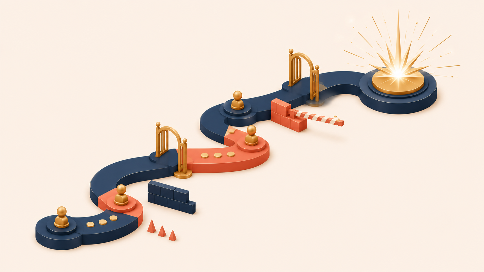
A good activation strategy starts with a clear picture of how a user moves from the first touchpoint to the moment of value. Without that picture, optimization is guesswork.
Customer journey mapping captures four things at every step:
- Entry points: Where does the user first encounter the product?
- Key actions: What steps must they complete?
- Emotional journey: How do they feel at each step?
- Potential barriers: Where do they get confused or frustrated?
Consider a team collaboration tool. A new user’s journey might unfold like this:
- Clicks an ad → uncertainty: “Will this actually help?”
- Lands on the homepage → exploration: “What does this do?”
- Clicks sign up → friction: “Another account to create?”
- Enters their information → impatience: “How long is this going to take?”
- Sees an empty workspace → confusion: “What now?”
- Creates a first project → hesitation: “Am I doing this right?”
- Invites the first teammate → anxiety: “Will my team find this useful?”
- Experiences the first real collaboration → aha moment: “This actually makes communication easier.”
Each step is a chance to reduce friction or raise motivation. But you cannot improve what you cannot see, which is why event-based analytics tools like Mixpanel or Amplitude are essential. The journey map gives you the questions; the analytics tool gives you the answers.
Analyzing the Activation Funnel: Where Users Drop Off
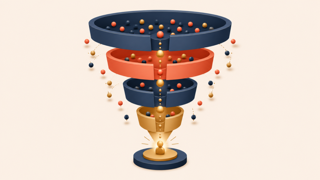
Once the journey is instrumented, the next step is to measure conversion at each stage. A typical activation funnel looks something like this:
Landing page views: 10,000 (100%)
    ↓ 45% conversion
Signup started: 4,500
    ↓ 72% conversion
Signup completed: 3,240
    ↓ 38% conversion
First action taken: 1,231
    ↓ 52% conversion
Aha moment reached: 640 (6.4% of total)
The aggregate numbers tell only part of the story. The real signal comes from segmenting the funnel:
- By acquisition channel: Do users from Google Ads activate at higher rates than users from organic social?
- By user attributes: Do business teams activate faster than individual users?
- By device type: Do mobile users struggle more than desktop users?
- By time of signup: Do weekend signups activate worse than weekday ones?
If LinkedIn-sourced users convert three times better than Instagram-sourced ones, that is a signal to rebalance the budget. If mobile users drop off at a specific step, the mobile experience needs attention. Aggregate numbers hide these patterns; segmentation surfaces them.
Combining Quantitative and Qualitative Research
Numbers show what happened. Surveys, interviews, and session recordings show why it happened. A serious activation effort needs both.
Once analytics flag a drop-off, the next step is to talk to users:
- Surveys to drop-off users: “What stopped you from completing [action]?”
- Interviews with successful users: “Was there a moment you almost gave up? What made you keep going?”
- Session recordings: Watch where users hesitate, hover, or get lost.
Imagine analytics show that 60% of users abandon the payment-details step. Session recordings might reveal confusion about why a free trial is asking for a credit card. Interviews might surface a deeper fear of being charged by accident. Now there is an actionable insight, not just a number. The fix could be a clearer charging policy, a visible trial countdown, and a frictionless cancellation flow.
The strongest activation programs combine breadth (the whole user base) with depth (specific segments and individuals). The goal is not just to find where users drop off but to understand why, and to test small fixes before rolling them out to everyone.
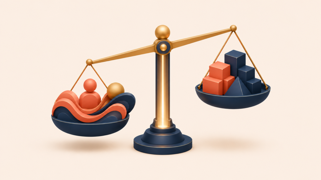
The Conversion Optimization Formula: Desire Minus Friction Equals Activation
One formula captures the core of conversion optimization:
Desire − Friction = Conversion Rate
Every product experience carries both desire (the reasons to continue) and friction (the reasons to stop). Effective activation increases the first and reduces the second.
Reducing friction does not mean removing every step. Some friction earns its place:
- Airbnb found that asking new users about location during signup — a small piece of friction — produced more relevant recommendations and ultimately a higher booking rate.
- LinkedIn requires thoughtful profile completion, which is high friction, but the resulting profile data drives more meaningful connections and better matches.
The question is whether the friction adds value for the user. Some friction filters out poor-fit users or increases commitment, which improves outcomes rather than hurting them:
- Qualification questions steer users into the experience that fits them.
- Progressive disclosure lets users learn complex features one step at a time.
- Intentional delays — like Medium’s estimated reading time — set realistic expectations.
The commitment and consistency principle is also at work here. Users who take a small action become more likely to take a bigger one. Game designers exploit this well: instead of explaining the controls, they open with a tutorial level that is almost impossible to fail. Before users even realize they are learning, they are already playing. Each small action invests them a little more deeply, and that investment keeps them engaged.
Common Onboarding Friction Points and How to Solve Them
Most onboarding friction falls into a few familiar patterns. Each has a known fix.
Complex Signup Forms
- Fix 1: Cut required fields to the minimum (email, password).
- Fix 2: Add social login (Google, Apple, Microsoft).
- Example: A SaaS analytics product reduced its signup form from 12 fields to 4 and saw completion rates rise from 34% to 59%.
Unclear Value Proposition
- Fix 1: Show how the product works before asking for a signup.
- Fix 2: Replace vague marketing copy with concrete, benefit-driven copy.
- Example: Replace “Transform your workflow” with “Turn a five-hour report into a five-minute one.”
Signup Walls
- Fix 1: Let users experience the core value before the signup ask.
- Fix 2: Use a “reverse funnel” — let users try the product first, then ask for a signup once they have invested time and effort.
- Example: Stripe lets developers explore the API through interactive documentation and runnable code samples before signing up — so the developer feels the value of the platform before hitting the account-creation step.
Payment Anxiety
- Fix 1: State the trial terms and cancellation steps clearly.
- Fix 2: Offer a “no credit card required” trial.
- Fix 3: Make the money-back guarantee visible.
The pattern in all four is the same: identify the moment of friction, name what the user is feeling, and either remove the step or make it clearly worthwhile.
Designing the Onboarding Learn Flow: Surveys, Interactive Tutorials, and Ethical Gamification
A learn flow is a deliberately designed path that helps users understand a product’s value and how to use it. Unlike static help docs, a learn flow actively pulls users toward success.
The right learn flow depends on how complex the product is:
- Simple, familiar products: Minimize explanation and get users acting fast. Instagram’s early onboarding assumed people already knew how photo apps worked — a tooltip or two, then out of the way.
- Complex or novel products: Use structured learning. Figma introduces its design tool through interactive tutorials, building skill one feature at a time through hands-on practice.
Onboarding Surveys
For products that need personalization, an onboarding survey does two things at once:
- Collects data to customize the experience.
- Signals that the product is investing in the user’s specific needs.
X (formerly Twitter) asks new users to pick interests and follow accounts, then immediately uses those choices to shape the feed. It is not just data collection; it is a visible promise that personalization is coming.
Keep surveys short — three to five questions — and tell users why you are asking each one:
- “Tell us your role so we can highlight relevant features.”
- “Pick your interests so we can customize your dashboard.”
- “What is your main goal? We ask so we can guide you better.”
Interactive Tutorials
Static tooltips are easy to ignore. Interactive tutorials get users doing the work, which builds understanding that sticks.
Effective tutorials follow a few principles:
- Show, don’t tell: Instead of saying “Click here to create a project,” walk the user through creating their first project.
- Provide context: Explain not just how but why the feature matters.
- Allow skipping: Experienced users should be able to bypass basics.
- Track completion: Monitor which tutorials get finished and which get abandoned.
Ethical Gamification
Gamification done well makes learning enjoyable. Done badly, it feels gimmicky. The difference is whether the game elements support the core value or distract from it.
What works:
- LinkedIn’s profile completeness meter nudges users to add information that makes the platform more useful for them.
- Duolingo‘s streak counter reinforces daily practice — the single behavior that most predicts language-learning success.
- GitHub’s contribution graph visualizes coding activity, reinforcing a habit that matters to its users.
What does not work:
- Points disconnected from any real value.
- Badges that interrupt the core workflow.
- Competitive leaderboards in a product designed for collaboration.
The test is simple: does the game element push the user toward the product’s core value, or get in the way of it?
Activation Triggers: Email, Push, and In-App Messaging Done Right
Triggers — emails, push notifications, in-app messages — can be powerful, or they can be the reason users uninstall. The difference comes down to two questions:
- Does the user actually care about this?
- Can they act on it right now?
If the answer to both is yes, the trigger has a strong chance of working. If either is no, it is just noise. The most effective triggers arrive right after a user experiences value — that is when momentum is highest and the next step feels natural.
Examples of well-timed triggers:
- Right after a user completes their first project → “Invite a teammate to collaborate?”
- Right after a user finishes a report → “Want to schedule this report to run automatically every week?”
- Right after an automation saves a user two hours → “Mind sharing a quick review of your experience?”
The pattern: ask when the value is fresh.
A handful of trigger types appear across most activation programs:
- Completion nudges: prompts to finish an unfinished setup or first action.
- Purchase incentives: limited-time offers tied to demonstrated intent.
- Reactivation messages: targeted outreach to users who have gone quiet.
- Feature announcements: contextual messages about a capability the user has not yet discovered.
Trigger effectiveness also benefits from the six principles of persuasion identified by psychologist Robert Cialdini — reciprocity, commitment, social proof, authority, liking, and scarcity. Applied ethically, they explain why people say yes. The key word is ethically: users notice manipulation, and once trust is gone, it does not come back.
A few warning signs that a trigger program has gone too far:
- Unsubscribe rates above 2% per campaign
- Open rates declining over time
- User feedback mentioning “too many notifications”
- A spike in users disabling notifications
The line between a helpful trigger and an annoying one comes down to relevance and timing. Send when it helps the user, not when it is convenient for the sender. Cap frequency, respect preferences, and measure long-term impact — not just the open rate of the next campaign.
Conclusion
User activation is not a single tactic. It is the practice of reducing friction while raising desire, applied at every step from first touch to the aha moment. Map the journey, instrument the funnel, layer in qualitative research, then redesign the friction points that show up. Pair the structural work with a thoughtful learn flow and triggers that arrive when value is fresh.
The teams that activate users well treat onboarding as a product in its own right — one that is measured, tested, and improved continuously. Once activation is working, the next challenge is keeping those users engaged over time. That is the focus of the next piece in this series: retention strategy, cohort analysis, and the three time horizons of keeping users around.
Growth Hacking Series
(1) What is Growth Hacking? Definition and Why Product-Market Fit Comes First
(2) Growth Equation and Experiment Framework: How to Decompose Growth into Levers
(3) User Acquisition Strategy: From AARRR Funnel to Channel Optimization
(4) User Activation Strategy: From Onboarding to the First Aha Moment
(5) User Retention Strategy: Cohort Analysis and the 3 Stages of Retention
(6) Monetization Strategy: From Pinch Points to Price Optimization
(7) Sustainable Growth Hacking Techniques: 6 Principles and a Growth Readiness Checklist