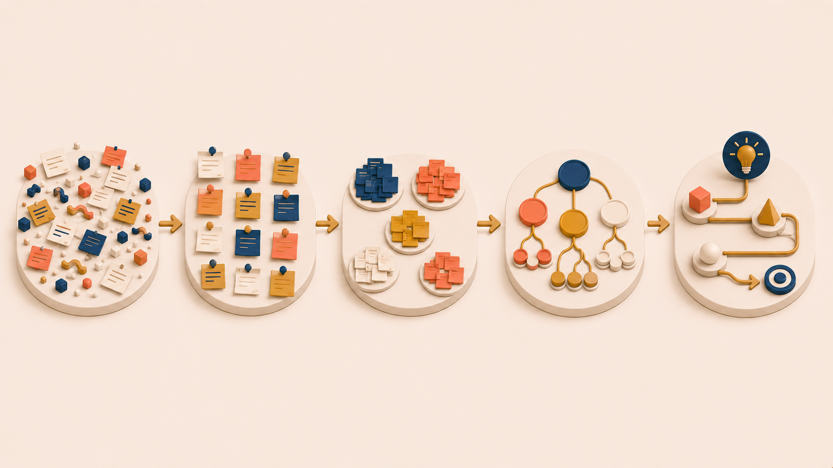
An affinity diagram often looks impressive on the wall and changes very little in the meeting that follows. The notes are colorful, the clusters are dense, and a week later no one references the board again. The problem is rarely the technique itself. Teams treat the affinity diagram as an arts-and-crafts exercise rather than a structured way to move from raw observations to decisions.
This guide walks through the five components that make up a working affinity diagram — raw qualitative data, externalization, clustering, themes, and insights — and the quality checks that separate a useful diagram from a decorative one. The five components run in order, and each layer turns the previous one into something the team can actually reason about together. By the end, you should be able to look at a finished board and tell whether it is doing the thinking work it was supposed to do.
The Five Components of an Affinity Diagram
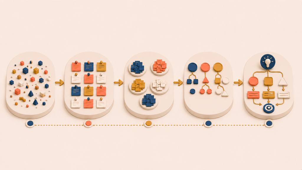
Before walking through how to build an affinity diagram, it helps to understand what one is actually made of. Many teams struggle not because they skip a step, but because they never clearly understood the components in the first place.
Five components make up an effective affinity diagram and transform raw research data into something a team can reason about together. Each component builds on the previous one, turning loose observations into a structure the team can act on.
Raw Qualitative Data: The Smallest Unit of Meaning
Everything starts with raw data — the most concrete pieces of information captured during research. Useful raw data includes direct quotes, observed behaviors, notable pauses or hesitations, workarounds or mistakes, and emotional reactions tied to a specific moment.
A simple test helps:
If it still feels like an interpretation, it is not yet raw data.
Consider the difference:
| Too abstract | Better raw data |
|---|---|
| “The user was confused by onboarding” | “The user re-read the same instruction three times before clicking ‘Next’” |
| “People do not trust the system” | “The user said, ‘I’m worried this will overwrite my existing data’” |
Keeping raw data this granular matters because grouping only works when the inputs are comparable.
Example: a cloud-based document collaboration tool
A product team is studying first-use onboarding for a cloud-based document collaboration tool. They want to understand why many new users create accounts but do not create or share a document on day one.
The team focused on three data sources covering the first ten minutes of use:
- Moderated usability test recordings (screen and audio)
- Session replays of new users who dropped off during onboarding
- Post-session interviews
Two researchers independently reviewed the recordings and transcripts. Each time they saw a specific behavior, hesitation, or verbal reaction, they paused and copied it into a working document, verbatim. Seven observations pulled directly from the recordings:
- “User paused mouse movement for 8 seconds on the ‘Create Workspace’ screen”
- “User said: ‘Can I change this name later?’”
- “User opened a new tab and searched ‘change workspace name later’”
- “User hovered over ‘Invite teammates,’ then clicked ‘Skip’”
- “User said quietly: ‘I shouldn’t mess this up’”
- “User deleted the default document within 3 seconds of it opening”
- “User leaned back and exhaled audibly after clicking ‘Finish setup’”
Nothing was rewritten or summarized. Each item represents a single moment observed in the data.
Externalization: Getting the Data Out of People’s Heads
Raw data sitting in a document or recording still carries hidden context. Affinity diagramming requires externalization — moving each observation out of the researcher’s head and onto its own movable surface. The rules are simple:
- One observation per card or note
- No combining multiple ideas into a single note
- Minimal interpretation in the wording
Whether the team uses physical sticky notes or a digital whiteboard, the goal is the same. Each piece of data should be movable, visible, and equal in weight to every other note on the board. This last condition prevents the team from distorting the pattern before it has a chance to appear.
In the cloud-document example, the team converted the extracted raw data into individual notes on a digital whiteboard. One observation per note. Original wording preserved. Nothing combined or explained.
- Note 1: “Paused 8 seconds on ‘Create Workspace’ screen”
- Note 2: “Said: ‘Can I change this later?’”
- Note 3: “Google search: ‘change workspace name later’”
- Note 4: “Hovered over ‘Invite teammates’ → clicked ‘Skip’”
- Note 5: “Said: ‘I shouldn’t mess this up’”
- Note 6: “Deleted default document immediately”
- Note 7: “Exhaled and leaned back after ‘Finish setup’”
At this point, every note sits on the board in no particular order. Nothing has been grouped or labeled yet.
Clustering: Grouping by Similarity
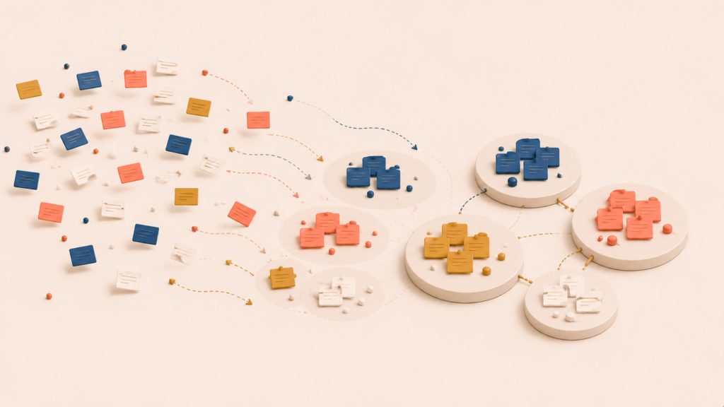
Once the raw data is externalized, the team starts forming clusters — groups of observations that feel related, even before anyone can fully explain why. At this stage:
- There is no “correct” grouping
- Intuition is allowed
- Discussion is deliberately minimized
Grouping in silence helps a great deal. It reduces anchoring on one person’s interpretation and lets multiple perspectives surface through action rather than argument. A cluster at this point is not yet a theme. It is a working hypothesis.
In the cloud-document example, the team began quietly moving similar notes closer together. A few notes shared a common pattern: hesitation right before a decisive action.
- “Paused 8 seconds on ‘Create Workspace’ screen”
- “Said: ‘Can I change this later?’”
- “Google search: ‘change workspace name later’”
- “Said: ‘I shouldn’t mess this up’”
These ended up together because all of them happened just before a decisive action and carried some uncertainty about whether the action was reversible.
Another cluster started to form around the pattern of avoiding visible or shared action:
- “Hovered over ‘Invite teammates’ → clicked ‘Skip’”
- “Deleted default document immediately”
- “Exhaled and leaned back after ‘Finish setup’”
These behaviors happened after setup, but they signaled discomfort with deeper engagement. As notes moved, the clusters shifted slightly. No labels or descriptions were attached yet.
Themes: Naming the Real Meaning Behind Clusters
Themes are where interpretation becomes explicit. A strong theme:
- Explains why the items belong together
- Reads as a short, clear sentence
- Reflects user intent, tension, or context
Compare two ways of naming the same cluster:
| Weak theme | Strong theme |
|---|---|
| “Onboarding issues” | “Initial setup creates fear of irreversible mistakes” |
| “Performance problems” | “Slow feedback breaks the user’s sense of progress” |
A strong theme gives the team something to discuss and act on. A weak one just restates the problem area.
Reviewing each cluster in the cloud-document example, the team asked what the grouped behaviors had in common. For the first cluster, they wrote:
“Initial setup decisions feel irreversible”
This theme connected the hesitation, the reassurance-seeking behavior, and the moments when users left the product to verify their assumptions elsewhere. For the second cluster:
“Users avoid visible action too early”
This theme connected skipping invites, deleting default content, and the emotional release after completing setup. Each theme was attached explicitly to one cluster, not to the board as a whole.
Insights: From Clusters to Insight Statements
A useful way to test a theme is to expand it into a sentence:
“Because ___, users tend to ___, which leads to ___.”
If the sentence feels vague or forced, the theme is probably still too abstract. This is the step where affinity diagramming connects to decisions without jumping straight to solutions.
In the cloud-document example, the team turned each theme into an insight statement.
From “Initial setup decisions feel irreversible”:
Because workspace creation appears permanent, users tend to pause, seek reassurance, or leave the product to verify safety, which leads to interruptions in the onboarding flow.
From “Users avoid visible action too early”:
Because early actions feel socially exposed, users tend to delay inviting others or creating content, which leads to weaker day-one engagement.
The team then checked these insights back against the original notes to confirm they still held.
If you are familiar with other qualitative synthesis methods, the resemblance is not accidental. Many sensemaking approaches follow the same pattern of moving from detail to meaning.
| Affinity diagram layer | Comparable concept |
|---|---|
| Raw data | Observations / notes |
| Cluster | Concept |
| Theme | Proposition or higher-level meaning |
Affinity diagramming is one of the more accessible versions of that pattern, which is part of why it shows up in so many UX research workflows.
Good vs Bad Affinity Diagrams: How to Tell the Difference
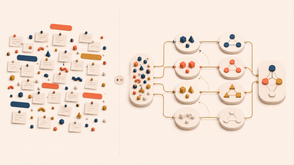
By the time a team finishes affinity diagramming, the wall (or digital board) often looks impressive. Visual density, however, does not guarantee insight. The difference between a good and a bad affinity diagram usually shows up in the days after the session, not during it.
Why Bad Affinity Diagrams Fail Quietly
Bad affinity diagrams rarely fail loudly. Nothing feels wrong in the moment. The board looks organized, the team feels productive, and then the artifact quietly stops being useful. Common symptoms include:
- Clusters labeled with vague nouns
- Themes that simply restate the problem area
- Insights that cannot be traced back to the data
- A diagram no one references a week later
A few concrete failure patterns recur:
| Pattern | Why it breaks down |
|---|---|
| Keyword lists (“Navigation,” “Performance”) | Describes the area, not the meaning |
| Overly broad themes (“UX issues”) | Hides differences instead of explaining them |
| Premature conclusions (“Users hate X”) | Overreads limited evidence |
| Decorative diagrams | Looks clean but cannot guide decisions |
These boards turn into dead artifacts: documented, then forgotten.
Weak affinity diagrams are usually not the result of laziness. They tend to come from a small set of recurring pressures:
- The team feels pressure to move quickly
- The team wants consensus too early
- People default to their existing mental models
- Labeling gets confused with understanding
When naming a cluster feels uncomfortable, teams reach for safe, broad terms. Unfortunately, those are exactly the terms that drain the diagram of its explanatory power.
What a Good Affinity Diagram Looks Like
A good affinity diagram works as a thinking scaffold. It helps the team reason more clearly after the session ends, not just during it. You can usually recognize one by a few traits:
- Themes are written as explanatory sentences
- Clusters reflect behavior, intent, or tension
- Disagreements are visible and recorded
- Raw data stays attached and traceable
A strong affinity diagram drives conversation. One of the most reliable quality tests is simple:
Can a teammate who did not attend the research sessions look at this diagram and understand what it means?
If the answer is no, the diagram still needs work. Strong affinity diagrams stand on their own because the language carries meaning, examples make the abstractions concrete, and the structure reflects how the team reached its insights.
Documenting Without Losing Insight
Another common failure is over-documentation. When teams lock down a diagram too early, they lose the chance to refine theme language, split or merge clusters, and revisit assumptions as new data arrives. A fixed artifact stops being a thinking tool and becomes a frozen snapshot of an earlier moment.
A healthier approach is to treat the diagram as versioned thinking. As user research continues, new observations get added, insights are reused, and the diagram evolves alongside the team’s understanding. The diagram is not the deliverable. The clearer thinking it produces is.
Conclusion
The five components — raw data, externalization, clustering, themes, and insights — turn scattered observations into something a team can act on. The quality checks come down to the same question in different forms: does the diagram help the team think more clearly, or does it just look like work?
An affinity diagram is a thinking tool, not a deliverable. When it is doing its job, it produces sharper conversations, clearer decisions, and a record of how those decisions were reached. When it is not, it becomes wall decoration.
The next article in this series looks at how affinity diagramming extends beyond UX research into strategy, engineering, and cross-functional alignment — and why the same five components keep showing up wherever teams need to make sense of complexity together.
Affinity Diagram Series
(1) What Is an Affinity Diagram? A Complete Guide to UX Research Synthesis
(2) How to Create an Affinity Diagram: 5 Components and Quality Checks