Good UX copy rarely comes from a flash of inspiration. It comes from a deliberate process — one that starts before a single word is typed, continues through multiple drafts, and ends in cross-functional review. The writers who consistently ship clear, useful microcopy are not the ones with the best vocabulary. They are the ones with the most reliable workflow.
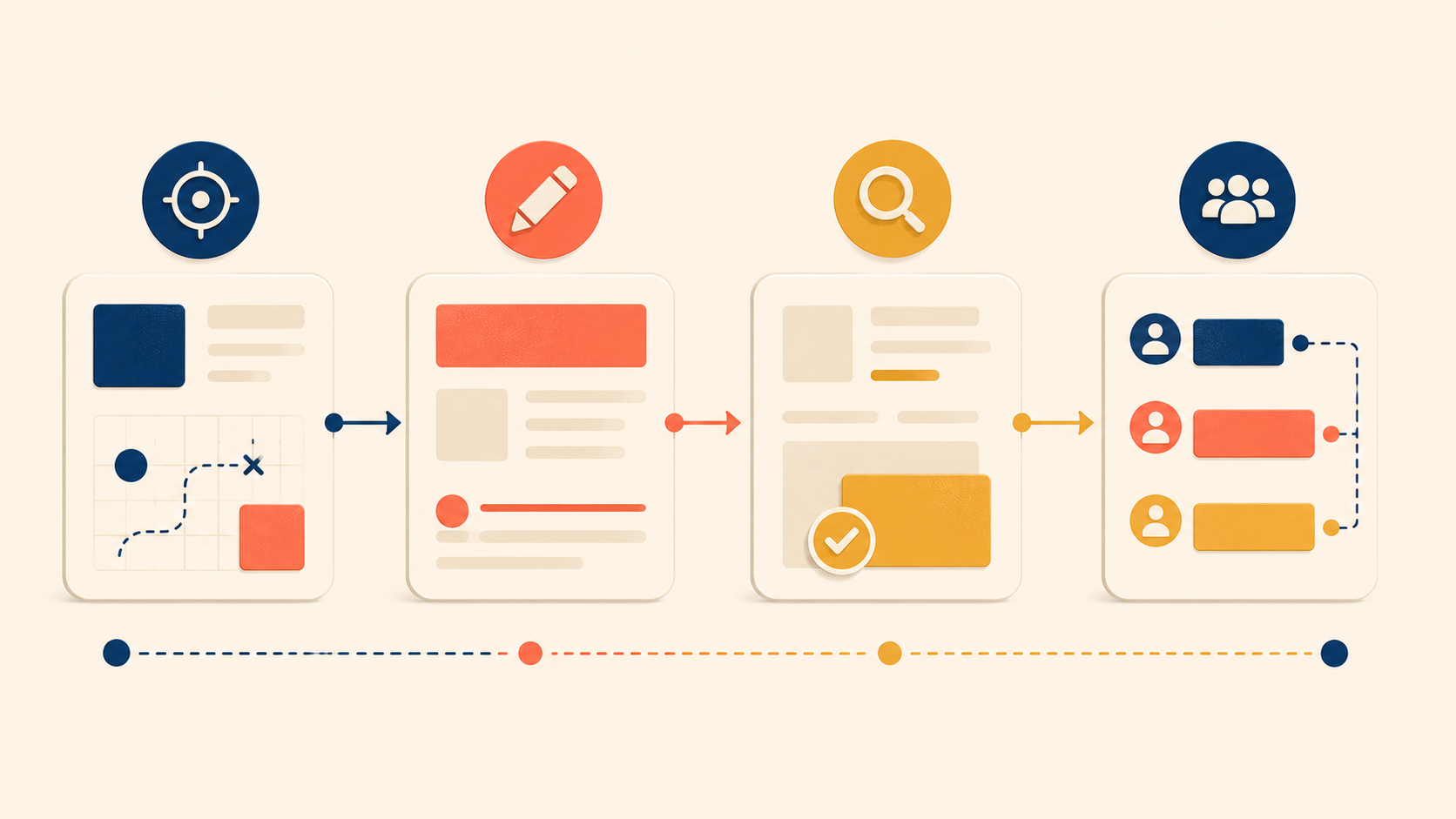
This guide walks through that workflow in four phases: what to do before you write, how to draft while you write, how to review after you write, and how to collaborate with designers and developers along the way. Treat it as a UX writing checklist you can return to for any screen, any feature, and any product surface. The goal is not to make writing slower. It is to make every round of writing build on the last one, so that your UX copy gets stronger instead of just longer.
Before Writing: Understand Your User and Context
Good UX writing starts long before you touch a keyboard. The fastest writers in this craft are not the ones who type the quickest — they are the ones who already know who they are writing for, why, and in what state of mind.
Define Your Reader
Every piece of UX copy has a reader. Before you draft, name that reader as concretely as you can:
- Who will actually see this text?
- How familiar are they with the product?
- What vocabulary do they use day to day?
- How comfortable are they with technical language?
Copy for a first-time visitor is not the same as copy for a power user. Copy for developers is not the same as copy for marketers. Knowing the reader is the foundation for every word choice that follows. Skip this step and you end up writing for an imagined “average user” who does not exist.
Map the Context
Even the same user needs different copy in different moments. A confirmation message after a successful payment lands differently than the same message after a failed payment. Before you draft, map the context the copy will live in:
| Context element | Question to answer |
|---|---|
| Emotional state | Is the user stressed, excited, confused, or rushed? |
| Previous action | What did they just do to land here? |
| Expected next action | What should they do after reading this? |
| Environment | Mobile or desktop? Public or private? Time-pressured? |
These four questions force you to picture the screen as part of a journey, not as an isolated string in a spec.
A Pre-Writing Checklist
Before you write the first draft, answer these questions. Keep them short — one line each:
- Who is the user for this screen or message?
- What situation are they in?
- What emotion are they likely feeling?
- What is the purpose of this text?
- What action should they take next?
- What is the minimum information they need to know right now?
If you cannot answer all six, you are not ready to write. Go back to the product manager, the designer, or the research notes. The cost of clarifying now is small. The cost of rewriting later — after a developer has shipped the wrong string into production — is much larger.
While Writing: The Three-Draft Method
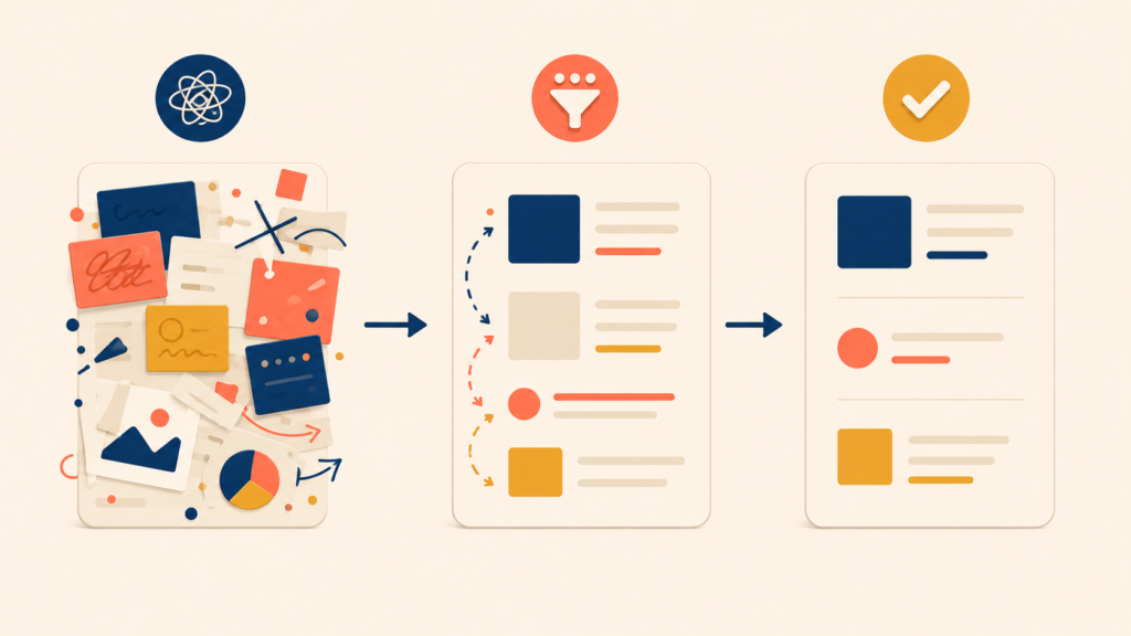
First drafts are rarely final. Effective UX writers do not try to write perfect copy in one pass. They write deliberately bad copy first, then sharpen it through a structured set of drafts. This three-draft method is the core of the UX writing process.
Three Drafts: Dump, Cut, Polish
Each draft has a different job. Trying to do all three at once is what makes UX writing feel slow and painful.
| Draft | Goal | Method |
|---|---|---|
| Draft 1 | Capture everything | Write down every piece of information you might need to convey. Ignore length. |
| Draft 2 | Cut hard | Remove anything non-essential. Aim to cut 30 to 50 percent. |
| Draft 3 | Polish and tighten | Simplify word choices, smooth the rhythm, and check consistency. |
Here is what the method looks like in practice on a single piece of copy — the empty state for a team chat feature.
Initial draft (everything):
“Welcome to team chat! This is where you and your teammates can talk about projects, share updates, and stay connected. To get started, you can create a new channel for a specific topic or project, or send a direct message to a specific teammate. Channels are great for group discussions that everyone can join, while direct messages are better for one-on-one conversations. You can also add files, images, and links to your messages.”
Condensed version (essentials only):
“Team chat is where your team talks. Create a channel for group discussions, or send a direct message for one-on-one conversations. Share files and links in any message.”
Polished final copy:
“Team conversations start here. Create a channel for group discussions, or message someone directly. Create your first channel →”
The first version is dense and forgettable. The third is a piece of UX copy a user can actually scan and act on. Notice that the work between Draft 2 and Draft 3 is mostly about rhythm and a single call-to-action, not new information.
Read It Out Loud
Reading UX copy aloud surfaces problems your eyes miss. Awkward phrasing becomes obvious, overly long sentences leave you out of breath, unnatural word choices stand out, and a missing rhythm becomes audible.
If a sentence sounds strange when you say it, it will feel strange when a user reads it. Voice acts as a built-in usability test for every line of UX copy you write.
Write Multiple Versions
For high-stakes copy — buttons in a paid flow, error messages on critical errors, onboarding headlines — do not stop at one version. Write three to five and choose. You are not deciding which version is right. You are widening the search for a better one.
| Version | Approach |
|---|---|
| Version A | The shortest version possible |
| Version B | Focused on the benefit |
| Version C | Focused on the action |
| Version D | More conversational |
| Version E | More direct |
Comparing versions side by side reveals trade-offs you cannot see in a single draft. Often the final copy is a blend — the verb from Version C with the rhythm of Version D.
After Writing: Self-Review, Peer Review, and UI Testing
A finished draft is not finished UX copy. Three layers of review separate a draft from a piece of microcopy that survives contact with real users: a self-review, a peer review, and a test in real UI context.
Self-Review Questions
Before you share copy with anyone else, run it through this self-review. The “if no” column is what tells you what to fix.
| Question | If “no”… |
|---|---|
| Is it understandable on one read? | Simplify the language and structure |
| Could you cut words without losing meaning? | Remove the unnecessary words |
| Are any words ambiguous? | Replace with concrete alternatives |
| Is the next action clear? | Add or sharpen the call-to-action |
| Does it match the voice and tone? | Adjust to your guidelines |
| Does it work on a small screen? | Shorten or restructure |
This is a UX writing checklist you can keep next to your screen. Most of the work of being a good UX writer is just running this list every time, not just on the strings you feel uncertain about.
Peer Review Done Right
A fresh pair of eyes catches problems that you have become blind to. To make peer review actually useful, set it up with intent:
- Share the context — who the user is, what situation they are in
- Ask specific questions (“Is the next step clear?” beats “What do you think?”)
- Do not explain the copy out loud (it has to work without you in the room)
The last point is the one most writers skip. If you have to narrate the copy for a reviewer to understand it, your real user will not have you on call.
Test in Real Context
UX copy that works in a doc can fail in a real product. Always test copy in conditions close to the live experience:
- In the actual UI, or in a realistic prototype
- On both mobile and desktop
- Inside the full sequence of screens, not just one screen in isolation
- With real target users, when possible
A single string that reads cleanly in a spec can collide with a button label, a system notification, or a loading state once it is placed on a screen. The test is not whether the words are correct. The test is whether the words still work when the rest of the UI is around them.
Collaborating with Designers and Developers
UX writing is not a solo discipline. Even the best self-edited copy can break when it lands in a final design or in production code. Effective UX writers treat collaboration with designers and developers as part of the writing process itself, not as a hand-off at the end.
Why UX Copy Is Never a Solo Job
The quality of UX copy is shaped by the surfaces it sits on. A button label is also a sizing constraint. An error message is also a state in a state machine. If the writer is the only one thinking about the words, the words will lose every fight with layout and code. Working with designers and developers from the start is what protects the copy.
Working with Designers
UX writing can plug into design at every stage, not just at the end. The earlier you join, the more influence you have over the final result.
| Stage | Where to collaborate |
|---|---|
| Early exploration | Discuss content needs before layout is locked |
| Wireframes | Draft real copy for wireframes (rough is fine) |
| Visual design | Refine copy as visual constraints become clear |
| Final review | Confirm text fits and reads well in the final design |
When UX writing collides with design, a few patterns repeat. Here is how to handle them:
| Problem | Solution |
|---|---|
| Text does not fit the space | Negotiate: can copy be shorter, or can the design change? |
| Placeholder text ships to production | Use realistic copy from the start. Avoid “Lorem Ipsum.” |
| Copy is added at the last minute | Ask to be involved earlier in the design process |
The placeholder problem is worth calling out. “Lorem Ipsum” is not just visually neutral — it is intellectually neutral, which means it hides every problem real copy would surface. Real copy in a wireframe is one of the cheapest UX writing best practices a team can adopt.
Working with Developers
Developers need a complete copy spec to implement a screen correctly. “Complete” means more than the happy path. For each component, you need every state.
| Component | States to cover |
|---|---|
| Button | Default, hover, loading, disabled |
| Form | Labels, placeholders, help text, error messages, success messages |
| List | Populated, empty, loading |
| Modal | Title, body, all buttons, error states |
| Notification | All variants and their related actions |
Before you hand copy to development, confirm that every state has text. Missing strings are how products end up with raw error codes, blank empty states, or buttons that say “OK” when they should say “Save changes.” The copy spec is not a polish task at the end — it is the artifact that prevents an entire category of bugs.
Conclusion
The UX writing process is not a creative ritual. It is a repeatable four-phase workflow: understand the reader and context before writing, draft in three structured passes while writing, review through self, peer, and UI tests after writing, and collaborate with designers and developers throughout. Each phase has a clear job. None of them can be skipped without paying for it later.
Run this workflow for one feature and the difference in copy quality is small. Run it for every feature for a quarter, and your product reads like it was designed by a single careful mind — because, in a way, it was. The next post in this series goes one level deeper, into element-level microcopy: how to write the buttons, error messages, empty states, and notifications that this workflow produces.
UX Writing Series
(1) What Is UX Writing? Definition, Reading Behavior, and Core Principles
(2) Voice and Tone in UX Writing: A Practical Framework with Examples
(3) The UX Writing Process: A Step-by-Step Workflow for Writing UX Copy
(4) Microcopy in UX Writing: Buttons, Errors, Empty States, and More
(5) UX Writing Mistakes to Avoid: 5 Patterns and Before/After Examples