Microcopy sits at the decision points of a product. It is the text on the button a user clicks to commit, the message that appears when something fails, and the line that fills an empty screen with direction instead of dead air. These tiny pieces of copy often carry more weight than headlines, because they show up exactly when a user is choosing whether to continue, retry, or leave.
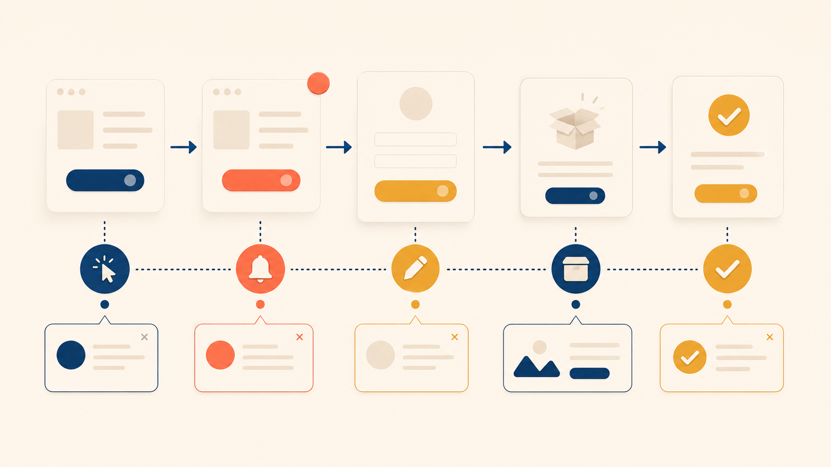
The previous article in this series covered the UX writing workflow — how to research, draft, and review copy with the team. This article moves from process to artifact — to the seven interface elements where microcopy decides whether users feel guided or stuck: buttons, error messages, empty states, onboarding and tooltips, notifications, form labels and placeholders, and confirmation messages. Each section pairs principles with concrete UX writing examples you can adapt to your own product.
Button Text: Drive Action with Clear, Specific Verbs
Buttons are some of the most consequential text in a product. They appear at decision points, and they directly influence whether a user acts at all. A vague button label adds doubt; a specific one removes it.
Four Principles for Effective Button Copy
Four principles cover most button decisions:
| Principle | What it means | Example |
|---|---|---|
| Start with a verb | Buttons should trigger action | “Create,” “Send,” “Download” |
| Name the outcome | Tell users what happens after the click | “Create account” instead of “Submit” |
| Keep it short | One to four words is ideal | “Save changes” (yes), “Click here to save your changes” (no) |
| Match user intent | Reflect what users are trying to achieve | “Find flights” instead of “Search” |
These principles work together. A verb without an outcome (“Submit”) tells users what to do but not what they get. An outcome without brevity (“Click here to create your free account today”) buries the action in noise.
Common Button Mistakes and Better Alternatives
Before writing a button, ask three questions:
- What happens when the user clicks this?
- What is the user actually trying to accomplish?
- Can the outcome fit in one to four words?
Generic labels fail these questions. Specific ones pass them.
| Generic label | Specific label |
|---|---|
| Submit | Create account / Send message / Place order |
| Click here | View pricing / Read the security policy |
| Yes / No | Delete file / Keep file |
| OK | Got it / Continue |
Notice that “Yes / No” pairs become risky on destructive actions. “Delete file / Keep file” tells users what each choice does. The user reads the button and knows the outcome — they do not have to re-read the dialog to decode “Yes.”
Error Messages: Match Tone to Severity
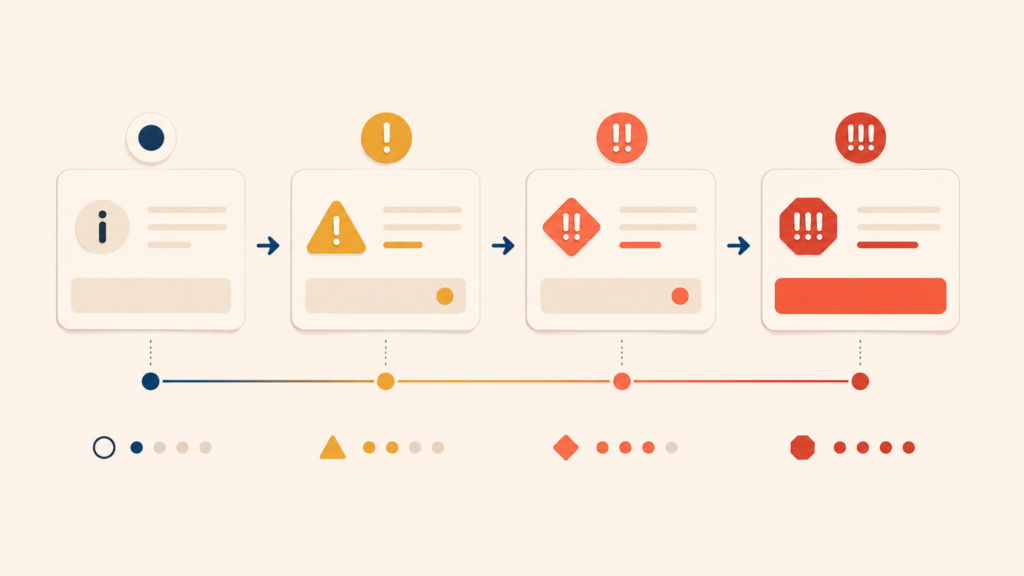
Not every error deserves the same voice. A typo in an email field is not the same as a session about to drop unsaved work. Treating them the same — either too casual or too alarmed — erodes trust. Match the tone to the severity, and the message to the cause.
| Error type | Tone | Example |
|---|---|---|
| Light / easy to fix | Neutral, instructive | “Enter a valid phone number (e.g., 555-123-4567).” |
| User action failed | Helpful, solution-focused | “Your message didn’t send. Check your connection and try again.” |
| System error | Apologetic, reassuring | “Something went wrong on our end. Your data is safe. Try again in a moment.” |
| Severe / data at risk | Calm, clear, urgent | “Your session expired. Log back in to keep your unsaved changes.” |
Some words drag the tone in the wrong direction. Avoid them:
- “Invalid” reads as accusatory — it blames the user before explaining the problem.
- “Failed” alone gives no context. Failed at what? With what consequence?
- “Oops” feels too light when real data is at risk.
- Error codes and exception names (“Error 500,” “NullPointerException”) are noise to most users. Surface them only when a support agent will need the code, and explain in plain language first.
A good error message tells users what happened, why it matters, and what to do next. A tone matched to severity makes that information easier to act on.
Empty States: Explain the Why and Show the Next Step
An empty state appears when a screen has no content to display — an inbox with no messages, a search with no results, a feed with no activity. The lazy version says “No data.” The useful version turns the empty screen into a guide.
A complete empty state covers four things:
- Current state — what the user is looking at right now
- Why it is empty — the reason there is no content
- How to fill it — an action the user can take
- A CTA button — a direct path to that action
| Screen | Weak empty state | Better empty state |
|---|---|---|
| Inbox | “No messages” | “No messages yet. Conversations with your team will show up here. Start a conversation →” |
| Search results | “No results” | “No results for ‘prodct.’ Did you mean ‘product’? Or browse by category →” |
| Favorites | “Empty” | “Your favorites will appear here. Favorite items for quick access. Browse items →” |
| Activity feed | “No activity” | “When teammates comment on your work, you’ll see it here.” |
The better versions do two things at once. They explain the absence (so the user does not wonder if something broke), and they point to the next action (so the user has somewhere to go). Empty does not have to mean blocked.
Onboarding and Tooltips: Progressive Disclosure in Practice
First-time users need guidance, but too much guidance overwhelms them. The principle that resolves this tension is progressive disclosure — reveal information when the user needs it, not all at once.
Four principles guide onboarding copy:
| Principle | How to apply it |
|---|---|
| One concept per screen | Each screen or tooltip covers a single idea |
| Show, don’t tell | Point at the actual UI element instead of describing it in the abstract |
| Provide an exit | Always include “Skip” or “Maybe later” |
| Focus on value | Explain what users can do, not how the feature works |
Tooltips are the smallest unit of onboarding copy, and they live or die by restraint. A good tooltip:
- Appears at the moment it is needed, not before
- Explains one element or one action
- Stays short — one to two sentences
- Closes easily and does not block interaction
| Tooltip that is too long | Tooltip at the right length |
|---|---|
| “Use this button to export your data in various formats such as CSV, Excel, and PDF. Before exporting, you can choose columns and apply filters.” | “Export data as CSV, Excel, or PDF.” |
The long version teaches a class. The short version answers the user’s question. When in doubt, write the short version and let users discover the rest by clicking.
Notifications: Earn the Right to Interrupt
A notification interrupts the user. That is its job. But because it interrupts, it has to justify the cost — the value of the message must clearly exceed the cost of the disruption. Match the type of notification to the right tone, and write only when you have something worth saying.
| Type | Purpose | Tone | Example |
|---|---|---|---|
| Success | Confirm a completed action | Positive, concise | “Message sent” |
| Info | Share a useful update | Neutral, clear | “New comment on your post.” |
| Warning | Prevent a potential problem | Calm, helpful | “Your subscription renews in 3 days.” |
| Error | Flag a problem | Urgent but constructive | “Payment failed. Update your card →” |
Before sending a notification, ask four questions:
- Why now? What triggered this message?
- What should the user do? Is there an action required?
- How urgent is it? Does it need immediate attention?
- Can it be ignored? Is this informational or action-required?
If the answers do not justify the interruption, the notification should not exist. Batch it, log it, or drop it. Notifications are a finite resource — every unneeded one makes the next needed one less effective.
Form Labels and Placeholders: Never Replace One with the Other
Forms are where users hand over data. When labels are weak, friction and errors follow. The simplest rule for form copy is to keep labels and placeholders doing different jobs.
| Element | Purpose | Visibility | Example |
|---|---|---|---|
| Label | Identifies what to enter | Always visible | “Email address” |
| Placeholder | Shows the format or an example | Disappears on input | “name@example.com” |
The critical rule: never use placeholder text as the only label. Once the user starts typing, the placeholder vanishes — and with it, the only cue about what the field was for. NN/G’s research labels this a harmful pattern: it taxes memory, breaks accessibility for screen readers, and forces users to delete their entry just to see the hint again.
A form copy checklist:
- Does every field have a visible label, not just a placeholder?
- Is required versus optional clearly marked?
- Are format expectations shown (for example, “YYYY-MM-DD”)?
- Is the character limit visible before it is exceeded?
- Do error messages appear next to the field they refer to?
Each item on this list prevents a small failure that adds up to abandonment.
Confirmation and Success Messages: Close the Loop with Specifics
After a user completes an action, the confirmation message closes the loop. A vague confirmation leaves users uncertain — did it work? Did the right thing happen? Did the email actually send? Specific confirmations remove the doubt.
| Vague label | Specific label |
|---|---|
| “Success!” | “Order placed. We’ve sent a confirmation email.” |
| “Done” | “Your changes are saved. The new settings are now active.” |
| “Complete” | “Account created. Start by setting up your profile →” |
These confirmations respect a user’s need for closure. The same specificity principle that prevents errors in pre-action confirmation dialogs applies here. A good confirmation answers three things:
- What was completed — name the specific action
- The result or impact — what is happening now as a consequence
- The next step — a related follow-up action, when appropriate
Notice that the strongest confirmations carry the next step inside them. “Account created. Start by setting up your profile →” does not leave the user at a dead end. It hands them the next reasonable thing to do, without forcing it.
That pattern — close the previous action, open the next one — turns a confirmation from a notification into a piece of UX writing that moves the user forward.
Conclusion
Across these seven elements — buttons, errors, empty states, onboarding, notifications, forms, and confirmations — three principles repeat. Microcopy should be specific (no “Submit,” no “Success!”), action-oriented (verbs over nouns, outcomes over abstractions), and contextual (matched to severity, timing, and user intent).
These are not separate disciplines. The same button principle that says “name the outcome” is the confirmation principle that says “what was completed.” The empty state principle of “show the next step” is the notification principle of “tell the user what to do.” Good microcopy is a single craft applied to many surfaces.
The next article in this series covers the mistakes that most often break this craft in practice — the failure patterns to recognize, and the rewrites that fix them.
UX Writing Series
(1) What Is UX Writing? Definition, Reading Behavior, and Core Principles
(2) Voice and Tone in UX Writing: A Practical Framework with Examples
(3) The UX Writing Process: A Step-by-Step Workflow for Writing UX Copy
(4) Microcopy in UX Writing: Buttons, Errors, Empty States, and More
(5) UX Writing Mistakes to Avoid: 5 Patterns and Before/After Examples