
Most companies lose customers faster than they realize. Yet sustainable growth comes from retention, not acquisition. Research from Bain & Company shows that a 5% improvement in retention can lift profits by 25% to 95%. If you acquire 1,000 users a month and lose 950, you barely grow. Cut the loss to 500 and your growth rate doubles, even without changing how you acquire users.
User retention as a strategy moves through a single arc: cohort analysis as diagnosis, stage-specific strategy for early, mid, and long-term retention, and reactivating zombie users who can still be recovered. The underlying principle is simple but easy to miss — keep delivering the core value that drew customers in the first place.
“The purpose of business is to create and keep a customer.”
— Peter Drucker
We’ll start where most teams go wrong: the metrics they look at.
Why Average Retention Metrics Mislead You
Cumulative average retention is dangerously misleading. If your overall retention is 60%, is that good? The average alone cannot tell you. It depends on questions the average hides:
- Are recent cohorts performing better or worse than older ones?
- Did the recent product change improve long-term retention, or just create a temporary bump?
- Where exactly are users dropping off?
Cohort analysis answers these questions. It groups users who share a common trait — usually their signup month — and tracks how each group behaves over time. The average mixes a thriving recent cohort with a churning old one and reports a number that describes neither.
What Cohort Analysis Reveals That Averages Hide
A cohort table surfaces patterns the average buries. Three patterns matter most:
- Improving retention: Newer cohorts hold up better than older ones (for example, the January 1-month cohort retains 45%, while April’s 1-month cohort retains 54%).
- Flattening curves: The decline slows as months pass (January drops 7% from month 1 to 2, then only 4% from month 2 to 3).
- The critical drop-off window: For most products, the first month is where the largest churn happens.
Each of these patterns suggests a different action. Improving cohorts tell you something is working. Flattening curves point to a stable core user base. A large first-month drop tells you where to focus your retention investment first.
How to Segment Cohorts: Cutting Retention Data Correctly
Retention rarely behaves the same way for every user. Real insight shows up when you slice cohorts by who users are, how they arrived, and how they use the product. Cut the data along different dimensions and you often find completely different behaviors:
- By acquisition channel: Do organic users retain better than paid users?
- By user segment: Do enterprise customers retain better than SMBs?
- By feature usage: Do users who adopt a specific feature retain better?
- By activation state: How much better do fully activated users perform?
The point of segmentation is not to make the picture more complex. It is to see it more clearly. When retention works in one channel, one segment, or one behavior but not others, that is not a problem — it is a signal that tells you where growth actually comes from, and where it does not.
Reading Retention Curves: Patterns, Not Just Numbers
A retention chart surfaces patterns that a table alone cannot show.
Retention rate (%)
100 |
    |
 80 |              Jan -----___
    |                  Feb ----___
 60 |                      Mar ---___
    |                          Apr --___
 40 |
    |
 20 |
    |
  0 |______________________________________
     0    1    2    3    4    5    6
              Months since signup
Two signals jump out from this kind of chart:
- Cohort-to-cohort trend: If newer cohorts retain better than older ones, your product or onboarding improvements are working.
- Shape of the decline: A steep early drop that flattens later means a core group of users keeps finding value.
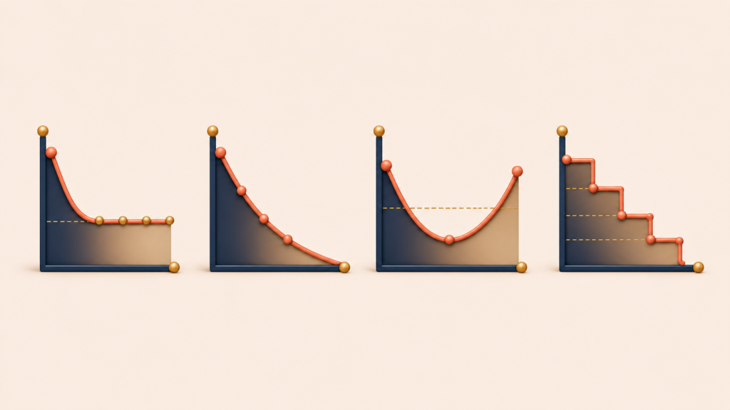
The shape of the curve also tells you what kind of retention problem you have:
- Smile curve: Retention drops at first, then climbs back up as users accumulate enough data or content to make the product more valuable. Common in note-taking and productivity apps.
- Flattening curve (most SaaS): A steep early drop that stabilizes around a core user base.
- Declining curve (a real problem): No stable floor. Users keep churning at every interval. The product is not finding a base of users for whom the core value sticks.
- Step curve (subscription models): Retention holds steady until renewal, then drops at the renewal point. The shape signals that retention is being driven by inertia, not active value.
The label matters less than what it implies for action. A flattening curve means double down on what makes the core stick. A declining curve means the core value is not landing — and no amount of growth tactics will fix that.
The Three Stages of Retention: Early (Days 1-14), Mid (Weeks 2-12), Long (3 Months+)
Growth expert Brian Balfour breaks retention into three stages, each with a different user mindset and a different strategy.
- Early retention (days 1-14): The user is deciding whether the product earns a place in their life. They are evaluating, exploring, and comparing alternatives.
- Mid retention (weeks 2-12): The user has decided the product has value. Now the question is whether it becomes a habit or stays an occasional tool.
- Long-term retention (3 months+): The product sits inside the user’s routine. Retention here depends on continuing to deliver value, evolving with the user, and not losing ground to competitors.
The specific time windows depend on the product. A meditation app measures early retention in days. Enterprise software measures it in months. Match the windows to how often users actually expect to use your product.
Early Retention Strategy: Time-to-Value, Empty States, and Preventing Early Churn
Most users who churn leave within the first week, and many of those cases were preventable. The goal in this stage is to get users to their aha moment as fast as possible and then make sure they have that experience again.
In this stage, the user is asking one question:
“Does this actually solve my problem? Is it worth the effort to learn?”
Four patterns kill early retention, each with a fixable cause.
Slow Time-to-Value (TTV)
You sign up for a budgeting app, but you cannot see any insight until you manually enter three months of transactions. The user wanted insight, but the work in front of them is data entry. By the time setup is done, the motivation is gone. Fix it by pre-filling sample data so users can explore the product immediately, automating data entry through bank connections, or showing meaningful insight even from partial data (“Here’s what we can already tell you from this week alone”).
The Empty State Problem
You sign up for a collaboration tool and find yourself alone in the workspace. Collaboration is the core value, but there is no one to collaborate with. The first user cannot experience the product’s main benefit. Fix it by seeding new workspaces with templates and example projects, providing solo-mode value (personal task management, notes) that works without a team, and making invites frictionless (one-click invites, view-only access without signup).
Overwhelming Complexity
You open a design tool and face 200 tools with no guidance about where to start. Too many options paralyze users. They cannot figure out what to do, and they start to feel incompetent. Fix it by showing basic tools first and exposing advanced ones progressively, using contextual tutorials that appear when users need them, and setting smart defaults that fit the most common use cases.
No Sense of Progress
A user finishes onboarding but cannot see what they accomplished or what to do next. Without visible progress, users do not feel like they are moving forward. Fix it by marking milestones explicitly (“Nice — you created your first project!”), showing progress indicators (“3 of 5 steps complete”), and quantifying early wins (“You just saved 15 minutes”).
Four early retention tactics consistently work across products:
- Well-timed reminder emails. Do not wait for users to remember on their own. Pull them back at strategic moments: day 1 with a welcome email and quick-start guide (catch them at peak excitement), day 3 with “you haven’t tried this feature yet” (before they forget), day 7 with success stories from similar users (social proof).
- Reducing small friction. Minor inconveniences compound. Allow guest access before forcing signup (let users try before committing), auto-save progress (so users don’t worry about losing work), and sync between mobile and desktop (so users can continue anywhere).
- Engineering small early wins. Make small achievements visible and celebratory: “You created your first project!” “You completed your first collaboration!” “You saved 10 minutes compared to your old workflow.”
- Just-in-time education. Do not try to teach everything upfront. Surface help at the exact moment users need it: contextual tips when users encounter a new feature, in-product video tutorials (not buried in documentation), and a searchable help center organized by use case rather than by feature list.
Mid-Stage Retention: Building Habits with the Hook Model
Mid-stage retention is about turning use into habit. Nir Eyal’s Hook Model is the most useful framework for this work.
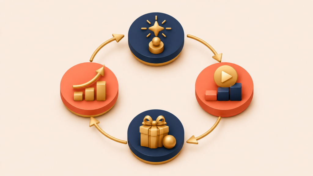
Trigger → Action → Reward → Investment → [back to Trigger]
- Trigger: A signal that prompts the user to act. External at first (notifications, emails), but the goal is an internal trigger — a routine or emotional state that prompts the user without any external nudge.
- Action: The behavior performed in anticipation of reward. It needs to be simple enough that users can complete it easily.
- Reward: Most effective when variable. Predictability kills anticipation. Variable rewards keep users coming back.
- Investment: The user puts something into the product — data, content, time, social capital. Investment raises the product’s value, raises switching costs, and primes the next trigger.
A real example:
Trigger: User feels bored → Instagram comes to mind
Action: Open the app and scroll the feed
Reward: Discover an interesting post (variable — you don't know what you'll find)
Investment: Like posts, follow new accounts, post your own content
Result: The feed gets more personalized, priming the next visit's trigger
Finding Incentive-Market Fit
Not every reward works for every user. Just as products need product-market fit, incentives need incentive-market fit — rewards that actually move a specific user segment.
For example:
- Developers: efficiency gains, technical elegance, community recognition
- Designers: visual polish, creative freedom, portfolio-worthy work
- Managers: team visibility, time savings, clear metrics
Test different reward structures and find what actually drives behavior. Try recognition (publicly surfacing achievements), status (badges, titles, leaderboards), access (early access, exclusive content), and practical perks (credits, discounts, premium features).
Do not focus only on active users. Users who could become power users with the right incentive often sit in the middle: those who visit frequently but don’t engage deeply, those who use one feature but ignore the rest, and those who show interest but haven’t crossed the activation threshold.
Designing for Habit Formation
Habit formation is really about removing friction from behaviors that genuinely help users.
- Claim an internal trigger. Decide which emotion or situation should remind users of your product. The strongest products occupy a specific moment in the user’s life. Slack owns “I need to ask my team something quickly.” Spotify owns “I want to listen to music.” Notion owns “I need to organize my thinking.”
- Make the action as simple as possible. Every step between trigger and reward is friction. Reduce clicks and taps. Optimize loading speed. Remove unnecessary decisions (“Should I create a project first, or a task?”).
- Vary the rewards. Predictable rewards get boring. Unpredictable ones build anticipation. Core value must stay consistent — variability adds to it, never replaces it. Mix expected rewards (progress bars, completion checks) with unexpected ones (teammate reactions, surprise milestones, new unlocks), and layer in achievement signals (streaks, levels, badges).
- Ask for investment that compounds value. Every bit of effort users put in should make the product more valuable to them: settings and preference customization, content and projects and data, inviting teammates or friends (network effects), and integrations with other tools.
The Ethical Boundary
There is a clear line between helping users build a habit and manipulating them into addiction.
Ethical products:
- Solve real problems users actively want to solve
- Respect users’ time and attention
- Make it easy to leave when users want to
- Do not exploit psychological vulnerabilities (fear, anxiety, compulsion)
Dark patterns to avoid:
- Hiding the unsubscribe button
- Making cancellation deliberately difficult
- Manufacturing artificial urgency
- Triggering FOMO to drive compulsive use
Ask yourself: would you be proud to explain this design decision to the user? If not, you are likely crossing the line.
Long-Term Retention: Feature Strategy and Personalization That Sustains Value
Long-term retention starts after users have built a habit and are actively engaged. A new question takes over:
How do you keep delivering value over months and years?
Long-term retention breaks down in predictable ways. The product stops moving while competitors evolve. User needs change but the product stays the same. Depth never grows, so the experience loses freshness. External conditions shift — economy, regulation, market.
Build Features That Add Value, Carefully
More features do not automatically add value.
Many teams fall into a “feature factory” mindset — shipping new features endlessly without checking whether they help users. Feature bloat usually hurts retention rather than improving it.
The question to ask repeatedly: “Does this feature deepen the core value, or does it distract from it?”
Reinforce the Core Value
Look for features that strengthen what users already love.
- Strengthen core workflows: A project management tool that only showed task lists adds time tracking, so users can also see how long work takes.
- Expand connected use cases: Notion started as notes, then added databases so users could build their own tools without leaving for another product.
- Strengthen network effects: Slack added channels and apps, making it harder for teams to communicate elsewhere.
- Increase switching costs: Every saved template, every connected integration, every automated workflow makes leaving more painful.
Test Safely with Staged Rollouts
Do not ship to everyone at once. Roll out in stages so you can experiment safely.
- Stage 1 (weeks 1-2): 10% of power users who give good feedback
- Stage 2 (weeks 3-4): Users who specifically requested this feature
- Stage 3 (week 5+): Gradual expansion to all users while monitoring metrics
Watch these metrics at each stage:
- Adoption rate: Of users who see the feature, what percentage actually try it?
- Retention impact: Do users of the new feature retain better than those who don’t use it?
- Cannibalization: Does it reduce usage of other core features?
- Unintended consequences: Does it confuse users or increase support load?
If a feature does not lift retention or core feature usage, reconsider whether it belongs in the product.
Personalize the Experience
As user data accumulates, you can tailor the experience to each user.
- Content recommendations: Spotify’s Discover Weekly feels like magic because it actually matches the user’s taste.
- Workflow optimization: Gmail’s Smart Compose predicts the next words based on usage patterns. It doesn’t just save time — it makes the product feel like it knows you.
- Proactive insights: “You usually have meetings Monday morning. Want to set one up this week?” The product anticipates needs before users articulate them.
- Adaptive interfaces: Frequently used features stay prominent, rarely used settings hide. The interface adjusts to actual usage patterns.
Personalization should feel helpful, not invasive. Users should understand why they’re seeing what they see, and they should be able to adjust personalization settings directly.
Manage Complexity with Progressive Disclosure
Veteran users start missing the simpler version of the product. New users get overwhelmed by feature complexity. Both problems have the same solution.
- Progressive disclosure: Notion hides databases, formulas, and relational features until users are ready for them.
- Customizable interfaces: Let power users hide features they don’t use, and let beginners hide complexity they don’t need.
- Smart defaults: Default settings work for most users; only those with special needs customize.
- Tier separation: Keep the base experience simple and offer depth in separate tiers for users who want complexity.
Reactivating Zombie Users: A Step-by-Step Process and Case Study
Not every churned user is gone forever. Users who signed up but barely used the product, or who were once active and then drifted away — call them zombie users — can be a significant opportunity.
Zombie users are cheaper to reactivate than new users to acquire. They already know the product and have completed initial setup. In many cases they did not leave because of a fundamental product problem — they left because of a busy period, a budget cut, or some other temporary reason.
Reactivating them works best as a structured experiment, not a generic “we miss you” blast.
The scenario: A project management SaaS finds 5,000 users who were active in their first month but have not logged in for over 60 days.
Hypothesis: These users were initially successful but got stuck at a specific workflow. Targeted education can reactivate them.
Test groups:
- Control: No contact
- Group A: Generic “we miss you” email
- Group B: Personalized email highlighting new features matched to their use case, plus a tutorial video
- Group C: Same as Group B plus a 30% time-limited discount
Results:
- Control: 2% natural reactivation
- Group A: 4% reactivation
- Group B: 11% reactivation
- Group C: 18% reactivation, but 40% of those churned again within 30 days
The lesson: Personalized education outperformed generic outreach. Discounts helped short-term reactivation but did not solve underlying product-fit problems. The team rolled out Group B’s approach to the rest of the zombie list.
You do not need to reactivate every churned user. Focus on users who left for solvable reasons — confusion, missing features, temporary circumstances. Users who never found value in the first place will not become valuable users just because you discount the price.
Conclusion
Retention is the stage where sustainable growth actually compounds. The arc above moved through three movements that build on each other.
Cohort analysis is the diagnostic step. Averages hide what cohorts reveal: which acquisition periods are improving, where in the lifecycle users drop off, and which segments retain. Without the diagnosis, retention strategy is guesswork.
The three stages of retention each need different work. Early retention is about removing friction to the aha moment. Mid retention is about turning use into habit, with ethical boundaries that separate help from manipulation. Long-term retention is about evolving the product so it keeps delivering value over years, not months.
Zombie reactivation captures value that would otherwise be lost. The best targets are users who left for reasons you can solve — not users who never found value to begin with.
The next post in this series turns to the fourth stage of AARRR: monetization. We’ll cover finding monetization pinch points, revenue cohort analysis, price optimization, overcoming the penny gap, and applying persuasion principles to pricing.
Growth Hacking Series
(1) What is Growth Hacking? Definition and Why Product-Market Fit Comes First
(2) Growth Equation and Experiment Framework: How to Decompose Growth into Levers
(3) User Acquisition Strategy: From AARRR Funnel to Channel Optimization
(4) User Activation Strategy: From Onboarding to the First Aha Moment
(5) User Retention Strategy: Cohort Analysis and the 3 Stages of Retention
(6) Monetization Strategy: From Pinch Points to Price Optimization
(7) Sustainable Growth Hacking Techniques: 6 Principles and a Growth Readiness Checklist