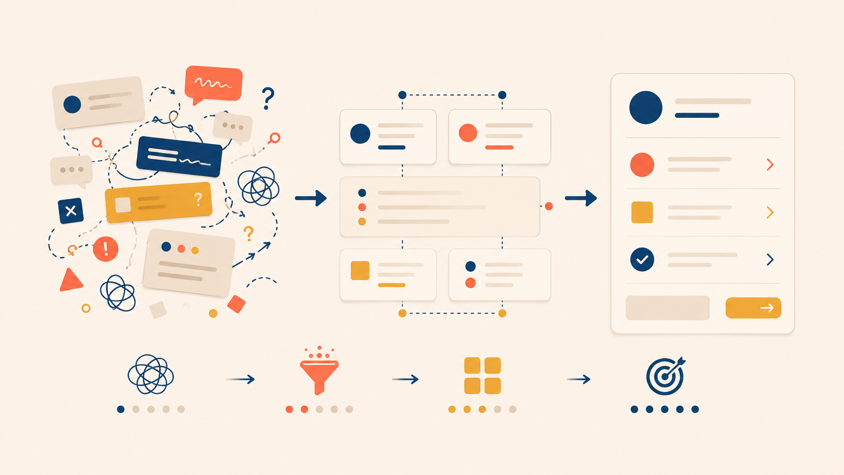
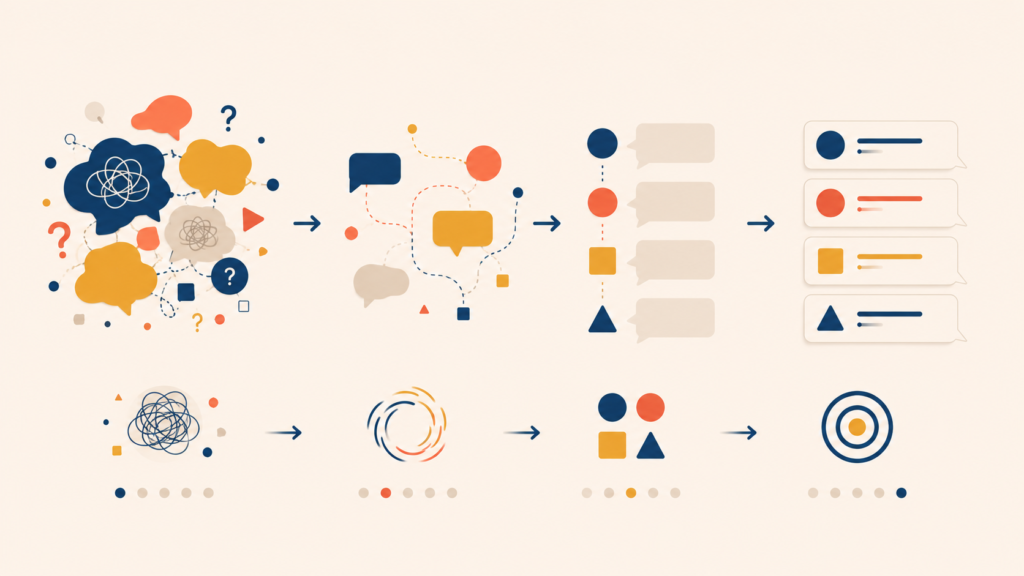
UX writing breaks in predictable ways. The previous article in this series covered microcopy for specific UI elements — buttons, empty states, error messages, notifications. This one looks at the patterns that derail those elements in practice: unnecessary emotion, vague generic terms, over-politeness, unhelpful error messages, and empty update announcements.
Each of these UX writing mistakes shares the same root cause. The copy is written for the team, not the user. Writers reach for excitement, buzzwords, or apology when what the user needs is a clear answer to “What is this?” and “What do I do next?”
The five patterns below come with before/after UX writing examples, and the final section closes with a case study showing the same feature announcement rewritten five times — from worst to best — so each principle compounds.
| Category | Pattern to Avoid | Core Problem |
|---|---|---|
| Unnecessary Emotional Language | Announcements that lead with feeling or filler instead of information | Adds length without adding meaning |
| Vague, Generic Terms | Abstract language that sounds impressive but says nothing concrete | Hides what actually changed |
| Over-Politeness | UI copy that hedges, apologizes, or asks too softly | Weakens clarity and confidence |
| Unhelpful Error Messages | Errors that announce failure without cause or fix | Leaves users unable to recover |
| Empty Update Announcements | “It’s new!” copy with no value or impact | Creates confusion and pushback |
Mistake 1: Unnecessary Emotional Language
Filler Words You Can Delete Without Losing Meaning
Some words appear constantly in product copy and add nothing. Remove them and the text gets cleaner without losing any meaning.
“We’re thrilled to share some exciting news!” and “Exciting update!” are the textbook examples. Users do not care how the company feels. They want to know what changed and how it affects them.
| Before | After |
|---|---|
| “We’re so excited to introduce our new dashboard!” | “New dashboard: see every metric at a glance” |
A short list of words can almost always be cut without changing meaning: actually, really, very, just, simply, easily, basically, and in order to (replace with to).
Run a quick test on any draft. Delete one of these words. If the sentence still says the same thing, the word was never carrying weight. Emotional framing belongs in marketing campaigns, not in the UI a user sees ten times a day.
Mistake 2: Vague, Generic Terms
The Worst Offender: “Experience”
The word experience sounds impressive and communicates almost nothing. It shows up everywhere in feature announcements and marketing-influenced product copy, often as a placeholder for whatever the writer could not be bothered to specify.
“An improved experience” can mean faster page loads, a redesigned interface, a new color palette, or all three. The reader has no way to know.
| Vague | Concrete |
|---|---|
| “An improved reading experience” | “Adjustable font size and dark mode” |
| “A smoother checkout experience” | “Checkout in 3 steps instead of 7” |
| “A better mobile experience” | “Every feature now available on mobile” |
The concrete version is longer, but it answers the only question the user actually has: what changed for me?
Buzzwords to Replace: Seamless, Intuitive, Robust, Leverage, Cutting-Edge, Streamlined
A handful of words behave the same way experience does. They feel substantial and turn out to be empty when you press on them.
| Buzzword | Problem | Better Approach |
|---|---|---|
| Seamless | Unclear what friction was removed | Describe the specific improvement |
| Intuitive | “Intuitive” is the user’s verdict to make, not yours | Show it, don’t claim it |
| Robust | Unclear which capabilities are included | List the actual features |
| Leverage | Business jargon | Use use |
| Cutting-edge | Meaningless superlative | Explain what is different |
| Streamlined | Unclear what was simplified | Name the part that got simpler |
A useful self-check: replace the buzzword with a specific outcome or feature. If you cannot, the word is hiding the absence of one.
Mistake 3: Over-Politeness That Weakens UI
When Politeness Hurts Clarity and Confidence
Adding “please” and softened phrasing to every screen feels courteous. In practice, over-politeness makes interfaces harder to scan and product voice less confident.
Over-politeness tends to:
- Lengthen instructions without making them clearer,
- Make the product sound uncertain or apologetic,
- Turn confident guidance into hesitant requests, and
- Add friction to every interaction.
| Over-Polite | Direct and Clear |
|---|---|
| “If you would kindly click the button below, you may continue” | “Continue” |
| “Could we ask you to enter your email address?” | “Enter your email address” |
| “Please wait a moment while we process your request” | “Processing…” |
Users do not read direct copy as rude. They read it as efficient. Clear guidance is help, not impoliteness.
When Softer Language Is Actually Right
Some moments do call for softer language.
- Asking for sensitive information: “We need your phone number to verify it’s you” reads better than an empty input field with no context.
- System-side errors: “Something went wrong on our end” admits responsibility and keeps trust.
- Asking for extra effort: “Help us improve? A 2-minute survey” respects the user’s time.
The dividing line is simple. When you are asking the user for something, use polite language. When you are helping the user reach a goal, use direct language.
Mistake 4: Unhelpful Error Messages
Why Most Error Messages Fail Users
Few things frustrate users faster than an error message that announces failure without explaining what went wrong or how to fix it.
| Bad Error | Why It Fails |
|---|---|
| “Error” | No information at all |
| “Something went wrong” | No cause, no fix |
| “Invalid input” | Doesn’t say which input or why |
| “Authentication failed. Please try again.” | Doesn’t explain why it failed |
| “Error code: 5023” | Technical jargon, meaningless to the user |
These messages force the user to guess. With no idea what they did wrong, they cannot fix it — and the likely next action is to abandon the task or hunt for support.
The What + Why + How Formula
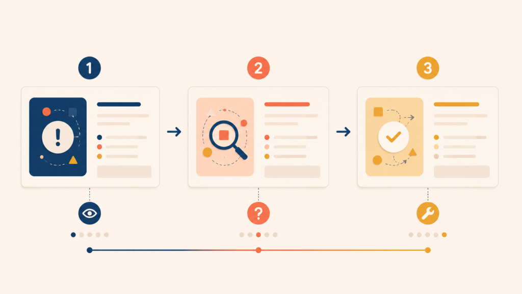
Effective error messages follow a simple structure.
[What went wrong] + [Why it went wrong] + [How to fix it]| Part | Example 1 | Example 2 |
|---|---|---|
| What | “Couldn’t send your message” | “Payment was declined” |
| Why | “The file is over the 25 MB limit” | “Your card has expired” |
| How | “Compress the image or send a smaller file” | “Update your card in Settings > Payment methods” |
| Full message | “Couldn’t send your message. The file is over the 25 MB limit. Compress the image or send a smaller file.” | “Your card has expired, so the payment was declined. Update your card in Settings > Payment methods.” |
Before shipping an error message, run it through four questions:
- Is it blaming the user? (“Invalid email” → “Use the format name@example.com”)
- Does it use technical jargon? Strip error codes and developer terms.
- Is there a clear next step? The user should know exactly what to do.
- Is the tone appropriate for the severity? A failed save needs a different register than a charged card that did not go through.
An error message that passes all four questions does the user’s job for them: it explains the failure, removes the guesswork, and points to the fix.
Mistake 5: Empty “It’s New!” Update Announcements
Why Vague Excitement Creates Confusion and Pushback
Most “new feature” announcements lead with vague excitement instead of clear value. A team ships a redesign or a new feature and the copy celebrates the work rather than the user’s gain.
Messages like “Check out our new homepage!” or “Explore our redesigned app!” tell the user that something changed without saying what, why, or what they should do differently. The benefit is missing. The next action is missing.
This creates confusion. Users land on an unfamiliar interface with no understanding of the intent behind the change, and the predictable reaction is “I liked it better before.”
| Unhelpful Announcement | Helpful Announcement |
|---|---|
| “Meet your new dashboard!” | “Your dashboard now shows weekly trends. The metrics that matter most are at the top.” |
| “We redesigned settings” | “Settings are now split into Account, Privacy, and Notifications. You can find what you need faster.” |
| “Experience the new look” | “The new navigation puts your most-used features one tap away” |
The What Changed + User Benefit + Next Action Structure
When announcing a change, follow three parts:
- What changed — the specific feature or area, not the whole product
- What’s in it for the user — the benefit, in concrete terms
- What to do next — where to look or what to try
The shift is from announcing the team’s work to answering the user’s actual question, which is always some version of “What does this mean for me right now?”
Case Study: Same Feature, Five Versions of Copy
Voice Memo Feature: From Worst to Best in Five Iterations
To show these principles working together, here is the same feature announcement rewritten five times, from the worst possible version to a strong one.
Scenario: A note-taking app is adding a voice memo feature.
Version 1: Worst
“We are absolutely thrilled to introduce a brand new feature to all of you! After months of hard work, our team is proud to unveil an innovative, cutting-edge voice recording capability. Experience a completely new way to capture your notes with our seamless, next-generation audio integration!”
What is wrong: emotional language (“absolutely thrilled”, “proud”), buzzwords (“innovative”, “cutting-edge”, “seamless”, “next-generation”), the actual feature is buried, and there is no user benefit.
Version 2: Still Falling Short
“New feature: We’ve updated voice memos! This enhanced feature lets you record audio for a better note-taking experience.”
What is wrong: “enhanced feature” and “better experience” add no information. There is no sense of when to use it or how it helps.
Version 3: Acceptable
“Voice memos are available. Record audio directly in any note.”
This is direct and clear. The user understands what the feature is.
Version 4: Good
“Capture ideas without typing. Tap the microphone icon in any note to record a voice memo.”
Leads with a user benefit, then explains how to access the feature.
Version 5: Best
“Capture ideas without typing. Tap the microphone icon in any note to start recording. Memos sync automatically across all your devices.”
Why it is the best: a clear benefit, a simple instruction, and an answer to the follow-up question the user is about to ask (“Does this sync?”).
Why the Shortest Version Isn’t Always the Best
| Version | Word Count | Clarity | User Benefit | Actionable |
|---|---|---|---|---|
| 1 | 46 | Low | None | No |
| 2 | 18 | Medium | Vague | No |
| 3 | 10 | High | Implicit | Partial |
| 4 | 16 | High | Clear | Yes |
| 5 | 21 | High | Clear | Yes |
Notice that Version 5 is not the shortest. Good UX writing is not a contest for the fewest words. The goal is to include exactly what the user needs to understand and act — no more, no less. Version 3 is shorter than Version 5, but it leaves a real question unanswered. Version 1 is the longest and answers none of them.
Conclusion
All five UX writing mistakes share three fixes: be specific, lead with user benefit, and give a clear next action. The patterns differ in surface, but the underlying failure is the same — copy that talks about the product or the team instead of helping the user.
The before/after examples above are a starting point. The harder work is building these checks into the workflow itself: a quick scan for filler words, a buzzword find-and-replace pass, four questions before any error message ships, and a “what changed / why it helps / what to do” structure on every update announcement.
The next article in this UX writing series moves from mistakes to a broader concern — writing copy that works across languages, abilities, and assistive technologies. We will cover localization-friendly writing, inclusive language, and accessibility, where the same principles of specificity and clarity carry even more weight.
UX Writing Series
(1) What Is UX Writing? Definition, Reading Behavior, and Core Principles
(2) Voice and Tone in UX Writing: A Practical Framework with Examples
(3) The UX Writing Process: A Step-by-Step Workflow for Writing UX Copy
(4) Microcopy in UX Writing: Buttons, Errors, Empty States, and More
(5) UX Writing Mistakes to Avoid: 5 Patterns and Before/After Examples