Changing a single word in a product interface can change how confidently a user completes a task — or whether they finish it at all. UX writing is the discipline behind those word choices. It covers every piece of text inside a digital product: button labels, error messages, onboarding flows, tooltips, notifications, menu items, and confirmation dialogs.
This guide is the first in a series on UX writing. It covers three foundations: what UX writing is and why it matters, how users actually read on screens, and the five core principles that separate clear interface copy from copy that gets in the way. Later articles in the series will go deeper into voice and tone, copy workflows, microcopy patterns, and common mistakes to avoid.
What Is UX Writing? Definition and Scope
UX writing is the craft of producing every piece of text a user encounters inside a digital product. Its goal is to guide users through tasks clearly and efficiently, not to persuade them or teach them broader concepts. The text that lives inside an interface is part of the design, and it deserves the same attention as the visuals and interactions around it.
UX Writing vs Copywriting vs Content Writing
UX writing sits next to two related disciplines that are often confused with it. Each one has a different goal, lives in a different context, and produces different kinds of text.
| Discipline | Primary Goal | Typical Context | Example |
|---|---|---|---|
| UX writing | Guide users through a task | Product interfaces | “Your password must be at least 8 characters.” |
| Copywriting | Persuade and convert | Marketing assets, ads | “Join millions who changed how they start their mornings.” |
| Content writing | Inform and educate | Blogs, help docs | A 1,500-word article on account security best practices |
Marketing copywriting aims for persuasion. Content writing aims for education. UX writing aims for clarity at the moment of decision — usually inside a few words of microcopy.
The Role of Microcopy in Product Interfaces
Microcopy is the small text that appears at decision points in an interface: the word on a button, the line under a form field, the message that shows up after an error. These short strings often carry more weight than long-form content because they appear exactly when a user is choosing what to do next.
The rise of dedicated UX writer and content designer roles reflects this. Many product teams now treat text as a core part of the experience instead of something to fill in after the design is “done.” When microcopy is treated as part of the design, the difference is visible: users hesitate less, ask for help less, and complete tasks more often.
Why UX Writing Matters for Product Experience
Words shape whether users complete a task, trust a product, and come back to it. A well-designed feature can still feel broken if the surrounding copy is unclear about what the feature does or why a user should care.
Four Ways UX Writing Drives Outcomes
Strong UX writing affects product outcomes in four concrete ways.
| Outcome | How UX Writing Contributes |
|---|---|
| Less friction | Clear instructions reduce hesitation during a task |
| More trust | Consistent, honest language makes the product feel reliable |
| Value delivered | Specific phrasing shows users what a feature actually gives them |
| Connection | Context-aware text makes users feel understood, not processed |
The last point matters more than it sounds. Good UX writing recognizes the user’s situation. It does not address a generic visitor with a generic message. It speaks to a person who just failed a payment, or just shared a file, or just landed on an empty screen. That recognition is what separates copy that feels mechanical from copy that feels designed.
Who Owns UX Writing on a Product Team
UX writing is not only the work of dedicated UX writers. In most teams, several roles contribute to the text users see.
| Role | Typical Contribution |
|---|---|
| Product manager | Defines messaging strategy, checks alignment with product vision, reviews copy against user needs |
| UX/product designer | Integrates copy into interface design, checks spatial constraints, partners on microcopy |
| Engineer | Implements strings, flags missing copy states, verifies technical accuracy |
| Marketer | Aligns brand voice with product messaging, keeps marketing and in-app text consistent |
| Customer support | Surfaces user confusion patterns, suggests improvements based on common questions |
On teams without a dedicated UX writer, these roles share responsibility. A designer might draft an initial button label; a product manager might rewrite an error message based on support feedback. The key is clear ownership and a review process, so that copy does not get pushed to the bottom of every sprint. Even when a UX writer joins the team, the collaboration does not go away — UX writers still need designers to confirm spatial constraints, engineers to confirm what is technically possible, and product managers to confirm strategic priorities.
How Users Actually Read on Screens
Users barely read text on a screen. That is the uncomfortable starting point for anyone who writes for a living, and it shapes every UX writing principle that follows.
Users Scan, They Don’t Read
Reading online is not like reading a book. Research on web reading behavior shows that attention is short, scanning is fast, and focus is selective. Nielsen Norman Group research found that users read only about 20-28% of the text on a web page. The longer the content looks, the less of it gets read. On mobile, where a line of text holds about five words, the problem gets worse.
This is the basic constraint of UX writing. Every word has to earn its place. Text that looks fine on a desktop screen can stretch across multiple mobile screens and feel overwhelming.
A few practical rules follow from this:
- Assume users will scan, not read.
- Place important information at the start.
- Keep sentences and paragraphs short.
- Test how copy looks across different screen sizes.
Three Scanning Patterns: F-Pattern, Layer-Cake, Spotted
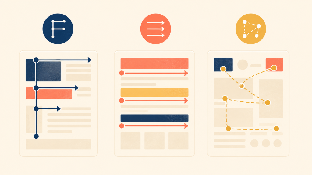
Eye-tracking research has identified three patterns that describe how users scan digital content. Understanding these patterns helps writers put important information where users actually look.
| Pattern | User Behavior | Writing Strategy |
|---|---|---|
| F-pattern | Reads the first line, then drops down and scans the left edge | Put key terms at the start of each line |
| Layer-cake pattern | Reads only headings, skips the body | Write specific, descriptive headings |
| Spotted pattern | Eyes jump to links, bold text, and numbers | Visually emphasize key information |
F-pattern. Users often read content in an F shape. They scan the top horizontally, drop down, scan a shorter horizontal line, and then run their eyes vertically down the left side. This means the first few words of every line carry the most weight. Important information belongs at the start of a heading or paragraph, not buried at the end.
Layer-cake pattern. When content has clear headings, users often read only the headings and skip the body text entirely. They are scanning for a section that answers their specific question. This pattern actually works in the user’s favor — if headings describe their content well. Generic headings leave users guessing; specific headings let them find answers fast.
Spotted pattern. Users’ eyes jump to anything visually distinct: links, bold text, numbers, buttons. Regular body text gets skipped while the standout elements pull attention. Strategic formatting can guide attention this way, but only if it stays selective. If every other word is bold or linked, nothing stands out.
Cognitive Load and Chunking
Every piece of text takes mental effort to process. When that effort exceeds the user’s attention, comprehension drops and frustration rises. Psychologist George Miller’s research found that human working memory can hold about 7 (±2) items at a time. UX writing has to respect that limit.
The difference between high and low cognitive load is usually structural, not stylistic.
| High Cognitive Load | Low Cognitive Load |
|---|---|
| A single field with the prompt “Enter your 16-digit card number, 3-digit security code from the back, and expiration date in MM/YY format” | Three separate fields labeled “Card number,” “Security code (3 digits on the back),” and “Expiration date (MM/YY)” |
| A long paragraph describing several features at once | A short paragraph focused on one feature |
| Technical jargon mixed with instructions | Plain language, with technical terms explained separately |
Three rules cover most cases:
- Break complex information into smaller chunks.
- Group related items together.
- In sequential flows, present one concept at a time.
Five Core Principles of Effective UX Writing
Five principles separate UX writing that helps users from writing that gets in their way. Each one builds on the reading behaviors above.
1. Cut Unnecessary Words and Be Specific
The first rule of effective UX writing is to remove words that take up space without adding meaning. These are filler words and ceremonial phrases that make text longer without making it clearer. The goal is maximum clarity in the fewest words possible.
| Before | After |
|---|---|
| “We’re excited to announce that you can now customize your dashboard” | “Customize your dashboard” |
The “before” version carries an emotional declaration (“we’re excited”) and a ceremonial structure (“we can now announce that you can now”). The “after” version delivers the same information in three words.
The second rule is to replace vague words with specific ones. Vague words create the illusion of communication without actually transferring information. Phrases like “enhanced experience” or “faster performance” leave users with no idea what changed or what they will get.
| Vague | Specific |
|---|---|
| “Improved viewing experience” | “Dark mode reduces eye strain in low light” |
| “Faster performance” | “Pages now load in under two seconds” |
| “Seamless integration” | “Connect your calendar in one click” |
Specificity builds trust. When users know exactly what they will get, they can decide for themselves whether it matters to them.
2. Clarity Over Wit: Don’t Make Me Think
Clever, witty copy is tempting to write. In UX writing, clarity always comes first. Users arrive at an interface with a goal — to complete a task, find information, or solve a problem. Ambiguous phrasing that requires interpretation only slows them down.
Steve Krug’s well-known usability principle, “Don’t Make Me Think,” applies directly to UX writing. Every second a user spends decoding a phrase is a second they are not making progress.
Two kinds of text in an interface play different roles.
| Text Type | Purpose | Example |
|---|---|---|
| Supporting copy | Sets tone, conveys personality, provides context | “Ready to jump in?” |
| Action text (CTAs, buttons) | Tells the user exactly what will happen | “Create account” |
Both matter, but they should not be confused. Supporting copy can be playful. Action text has to be immediately clear.
The same principle applies across surfaces in an interface. Some places welcome personality; others demand directness.
| Location | Wit Allowed? | Example |
|---|---|---|
| Headlines and subheadings | Yes | “Ready to jump in?” |
| Button labels | No — clarity first | “Create account” |
| Onboarding welcome screen | Yes | “Let’s get started” |
| Error message resolution | No — direct | “Check your card details and try again” |
| Empty state description | Yes | “It’s quiet here… that will change soon” |
| Form field labels | No — be clear | “Email address” |
The best UX writing keeps personality in the supporting copy while keeping action text clear and unambiguous. Users get to enjoy a brand’s voice without losing confidence about what an action will do.
3. Speak in Benefits, Not Features: The “So What?” Test
Most vague copy comes from focusing on features. Product teams know what they built, so they describe the feature. But users care about what they get.
After writing a piece of copy, ask: “So what? What changes for the user?” If the answer is not concrete, the copy is too vague. “Better collaboration” means nothing until it names the specific pain point being solved.
| Fails the Test | Passes the Test |
|---|---|
| “Revamped search” | “Find files by content, not just by filename” |
| “Settings page redesign” | “Adjust notification settings in half the steps” |
| “Enhanced collaboration features” | “Leave comments directly on images and documents” |
The “so what?” test is brutal, but it works. It forces writers to translate what was built into what the user actually receives.
4. Write for Context: Same Word, Different Meaning
The same word can be perfect in one situation and confusing in another. Effective UX writing considers not just what to say but when and where the user encounters the text.
Four questions help frame the moment before writing copy:
- What just happened? Did the user succeed, fail, or take a specific action?
- How might the user feel? Frustrated, confused, expectant, anxious?
- What does the user need to know right now? Only what matters at this moment.
- What should the user do next? The logical next step.
A “Delete” button makes a useful example. The action is the same, but the copy should change with context.
| Context | Better Copy | Why |
|---|---|---|
| Delete an email draft | “Delete draft” | Low-stakes situation; simple confirmation is enough |
| Delete an account | “Permanently delete my account” | Data loss is sensitive; explicit clarity is needed |
| Delete a shared file | “Delete for everyone” | Action affects others; scope must be clear |
Context-aware copy works because it answers a question the user is already asking. When the copy matches the moment, users do not need to stop and think.
5. Use the Same Word for the Same Action: Consistency Builds Trust
Different words for the same action make users lose confidence. They wonder whether “Cancel,” “Unsubscribe,” and “End membership” do the same thing or different things.
Consistency matters for clear reasons:
- It reduces cognitive load — users learn the pattern once.
- It builds familiarity and confidence.
- It prevents confusion about what a feature does.
- It signals product quality and reliability.
| Inconsistent | Consistent |
|---|---|
| “Save” / “Save changes” / “Update” for the same action | “Save” everywhere |
| “Log in” / “Sign in” / “Sign-in” | Pick one and use it across the product |
| “Delete” / “Remove” / “Trash” | Define when each term applies |
A short glossary that lists which word is used for which action — and which words are off-limits — solves most of this. When a team agrees on its vocabulary, users do not have to.
Conclusion
UX writing is not decoration on top of design. It is part of the design, and it shapes whether users finish what they started, trust what they see, and come back the next time. The foundations covered here — what UX writing is, how users actually read, and the five principles of clear interface copy — are the basis for everything that follows in the series.
The next article in the series goes deeper into the layer above individual copy: the voice and tone that hold a product’s writing together across screens, situations, and brand moments.
UX Writing Series
(1) What Is UX Writing? Definition, Reading Behavior, and Core Principles
(2) Voice and Tone in UX Writing: A Practical Framework with Examples
(3) The UX Writing Process: A Step-by-Step Workflow for Writing UX Copy
(4) Microcopy in UX Writing: Buttons, Errors, Empty States, and More
(5) UX Writing Mistakes to Avoid: 5 Patterns and Before/After Examples